Before we can jump into Xcode and start building our awesome UI, we need to take a moment to go over some necessary basics. This post will be split in two parts — in the first one we’ll learn about layout constraints and Auto Layout requirements.
Contents
What is Auto Layout?
Simply put, Auto Layout is a layout system that we feed a set of relationships between views to achieve the layout we want. Instead of setting a view’s position to an absolute value, the position is described in relation to another view, e.g. "the top edge of the button should align with the bottom edge of the label". Note that when it comes to view’s size, we can use both relations and absolute values, for example it is completely valid to say "the width of the image view should be 150 points".
Needless to say it’s important to describe the relationships in such a way that the resulting layout is unambiguous. We cannot have the button’s top edge aligned with the label’s top and bottom edge at the same time (assuming the label’s height is greater than zero). If we attempt to do that, Auto Layout will (rightfully) complain.
Layout constraints
Constraint is our go‐to tool when it comes to creating our layouts as it provides the programming interface to define the relationships mentioned above. In order to create a constraint, we must specify at least one of the constraint attributes (e.g. width or the view’s left edge) and a relation (e.g. equal to). For the layout system, each constraint is a linear equation with the following format:
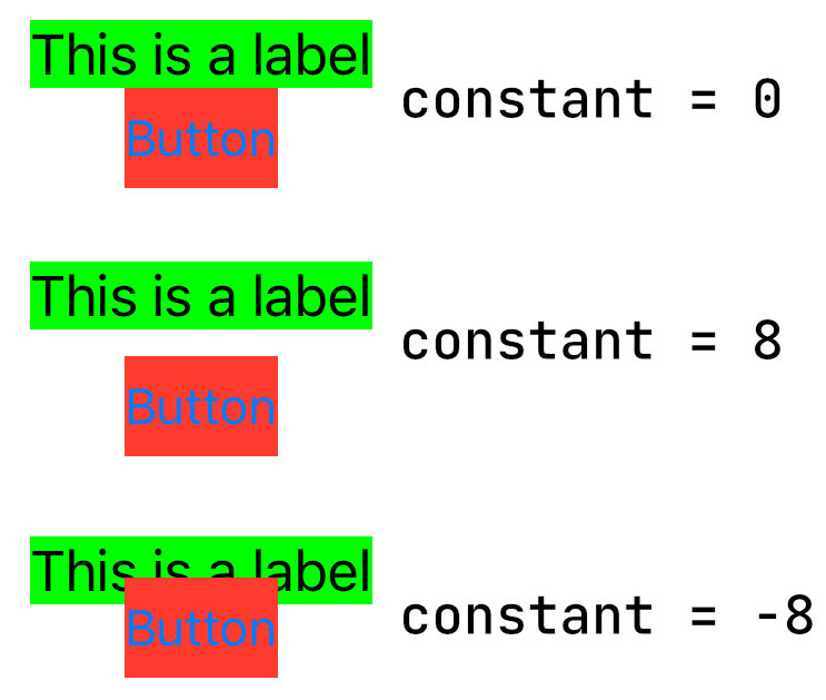
item1.attribute1 = multiplier × item2.attribute2 + constantOur earlier example, "the top edge of the button should align with the bottom edge of the label", would look like this:
button.top = 1.0 × label.bottom + 0We’ll look at how the multiplier and constant values affect the constraint shortly. In this case, the multiplier is 1 and the constant is 0, thus the example could be further simplified as:
button.top = label.bottomConstraint attributes
In the example above, we used the top and bottom attributes. Of course, there are many others we can use:
top,bottom,left, andrightattributes to align view's edges,centerXandcenterYattributes to align view's centers,widthandheightattributes to set view's size.
Additionally, there are also leading and trailing edge attributes, specifically for when supporting right-to-left (RTL) languages. For RTL languages, the leading edge is on the right side of the screen while the trailing one is on the left. If you use these attributes instead of left and right, Auto Layout will align your views properly depending on the user’s locale.
Constraint multiplier and constant
If we changed the constant to something other than zero, the button’s top edge would be offset (by screen points) from the label’s bottom edge, either up or down depending if the constant is positive or negative:
The multiplier is commonly used with the size and center attributes, for example we could make the label’s width fill half the parent’s view width by setting the multiplier to 0.5.
label.width = superview.width × 0.5Constraint relation
So far we’ve only seen examples using the equal to relation that specifically defines a relationship between two constrained items. Sometimes though we might want to define a somewhat loose relationship to describe a layout where the equal relation just does not cut it.
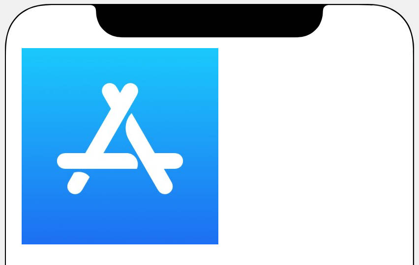
For example consider we want to display an image. It should appear at its natural size if possible, but at the same time it should never appear beyond the screen bounds. Since we don’t know the size of the image beforehand or the device that will be used to display it, we need to make use of the inequality relation to describe the layout. In the example below the image has a size of 1500x500 pixels which is clearly more than can fit on the phone’s screen horizontally:

We could add the following constraints:
(1) image.left = superview.left + 16
(1) image.top = superview.top + 16
(2) image.width = natural_image_width
(3) image.height = image.width × (1.0 / 3.0)- The left and top edges are pinned to the matching edges of the superview, which fixes the image's horizontal and vertical position.
- The width is set to a constant, the natural width of the image file.
- The height is set to a third of the image's width, keeping the aspect ratio of the image.
Now this gets us the first requirement, that is display the image at its natural size. However we still didn’t handle the screen clipping. To fix that we’ll add another constraint, this time with the less than or equal to relation:
(4) image.right <= superview.right - 16This constraint will ensure that the right edge of the image is always less than the right edge of the superview, minus some margin:

This will satisfy the second requirement of the image never exceeding the screen bounds. However we now introduced another problem — constraint ambiguity! Notice how we tell Auto Layout to set the image’s width to its natural width and at the same time make sure that the image’s right edge is smaller than the screen’s right edge. It’s obvious both of these requirements cannot be satisfied at the same time in some scenarios (e.g. when the image is too large for the device’s screen) and thus Auto Layout will complain. This is where constraint priority is ready to make its appearance like the hero we need!
Constraint priority
Constraint priority is simply a number from 1 to 1000 indicating how "important" a given constraint is. The higher the number, the higher the priority with which Auto Layout tries to satisfy the constraint. By default each constraint has a priority of 1000 (known as required). Auto Layout always tries to satisfy required constraints and if it cannot do so because of a conflict, we have an erroneous layout. When a constraint has a priority lower than 1000, the constraint is said to be optional and as such Auto Layout may ignore or only satisfy it as best as it can if it would result in a conflict with other required constraints. That means Auto Layout attempts to resolve required constraints first and only then moves on to the optional ones.
How could we apply this knowledge to our image example above? First we need to identify the constraints that are in conflict — we’ve already done that, it’s the (2) image.width and (4) image.right constraints. Next we need to determine which of these two constraints we want to satisfy at all times. Clearly it’s the (4) image.right constraint as we never want to have the image clipped by the screen. Thus we would mark the (2) image.width constraint as optional by lowering its priority. Auto Layout would then attempt to set the image’s width as close as possible to its natural width, but at the same time ensuring it does not violate the required (4) image.right constraint.
Note if we were to display a naturally smaller image, our constraints would still possess no problems for Auto Layout, as the right edge of the image would be less than that of the superview and the image’s width would match its natural size:
Auto Layout requirements
If we want to be good friends with Auto Layout we need to meet a few simple requirements. Let’s take a look what those are.
1. View hierarchy
First thing of major importance for us to remember — a view must be added to a view hierarchy before any constraints can be activated. Furthermore, views in different view hierarchies cannot define relationships between each other. If we fail to meet these requirements, our app will crash. If that’s not enough of a reason, it’s also illegal as mentioned by the fatal error message:
Unable to activate constraint with anchors <NSLayoutYAxisAnchor:... "UIView:0x14d609480.top"> and <NSLayoutYAxisAnchor:... "UILayoutGuide:...'UIViewSafeAreaLayoutGuide'.top"> because they have no common ancestor. Does the constraint or its anchors reference items in different view hierarchies? That's illegal.We should not be doing illegal things!
2. Minimum number of constraints
In the very first example we mentioned only one constraint, i.e. "the top edge of the button should align with the bottom edge of the label". As you can imagine, this only tells part of the story, and Auto Layout simply needs to know more to build a valid layout.
What else is needed then? Every view needs to have its position (both horizontally and vertically) and size (width and height) defined. In practice, this usually means we need to add two horizontal and two vertical constraints per view. Sometimes fewer constraints will do the job just fine, for example when dealing with views with an intrinsic size (we’ll talk about that in part two).
Let’s take a look at the following example to see the necessary constraints we need to define for two views in our hierarchy:
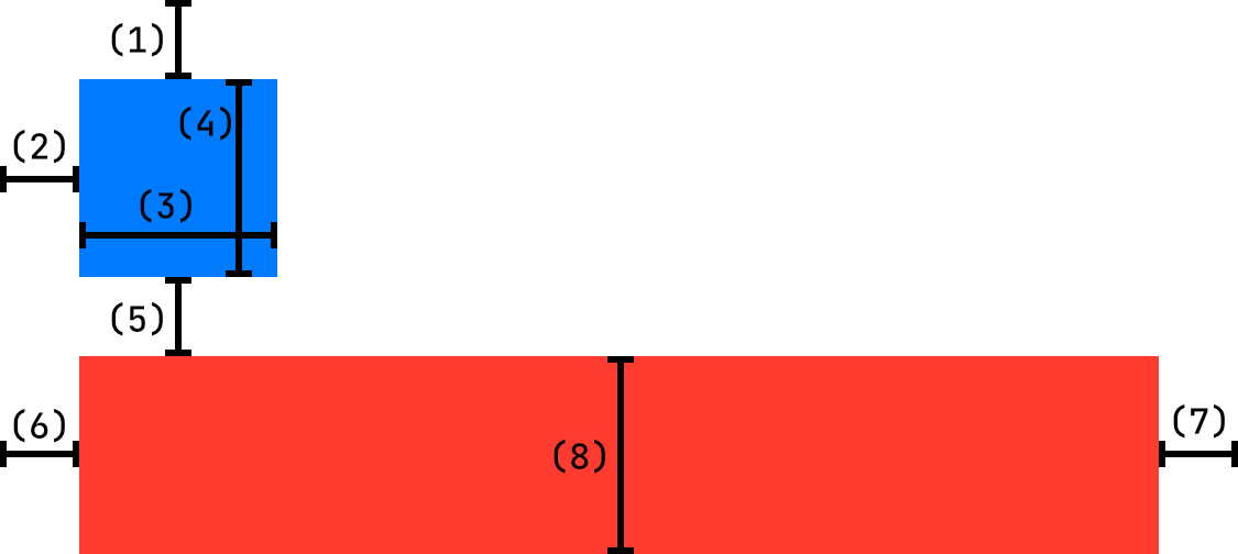
(1) blueBox.top = superview.top + 24
(2) blueBox.left = superview.left + 24
(3) blueBox.width = 60
(4) blueBox.height = 60

(5) redBox.top = blueBox.bottom + 24
(6) redBox.left = superview.left + 24
(7) redBox.right = superview.right - 24
(8) redBox.height = 60
As we can see, each view has two horizontal and two vertical constraints. Auto Layout is happy! Take any of those constraints away and our layout will look quite differently.
A few things to note:
- It's generally not advised using constant width and height constraints. Rather, defining them in relation to other views or dimensions is strongly preferred. Nothing particularly terrible would happen in the example, but other layouts using constant sizes could result in views being clipped, e.g. on smaller devices or when rotating the device. Only use constant sizes when you know what you're doing.
- Each view defines its width differently. The blue view uses constant
widthconstraint, while the red one uses itsrightattribute in relation to the superview. - Constraint #7 uses a negative constant to inset the view's right edge.
We could easily describe the red view’s width using the width attribute in relation to the superview as well. We would just have to decrease the width by the margins on the left and right sides, thus the constant would be 24 + 24 = 48:
redBox.width = superview.width - 48We could also avoid using a negative constant by having the constraint defined from the superview’s perspective:
superview.width = redBox.width + 48I prefer to use negative constants, but it’s up to you which approach you choose. Just know that there are often multiple ways of defining the same layout.
3. Unambiguous layout
As we mentioned earlier, the set of constraints we define must result in an unambiguous layout. If two or more constraints are in conflict and cannot be satisfied, it is an error, and it should be fixed when encountered during the development phase. Auto Layout will warn us with a warning printed to the Xcode console and show us the problematic constraints:
[LayoutConstraints] Unable to simultaneously satisfy constraints:
...
It will still attempt to find a somewhat working layout by removing one or more of the conflicting constraints, however even if your layout turns out fine it’s a good idea to fix the underlying problem.
Conclusion
This concludes the first part of the introduction to Auto Layout and layout constraints. Don’t worry if the concept of layout constraints is still a bit fuzzy. It will become much more natural to think about once we start coding some real examples.
Table of contents
- Intro
- Basics, Part One (reading now)
- Basics, Part Two
- Xcode Setup
- Sign Up Screen
- Stack Views
- Custom UIAlert
- Players Profile
- Twitter Timeline
- Twitter Profile
- Music Album