Overview
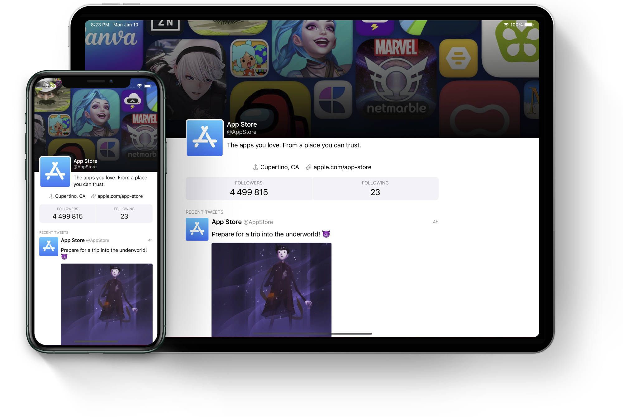
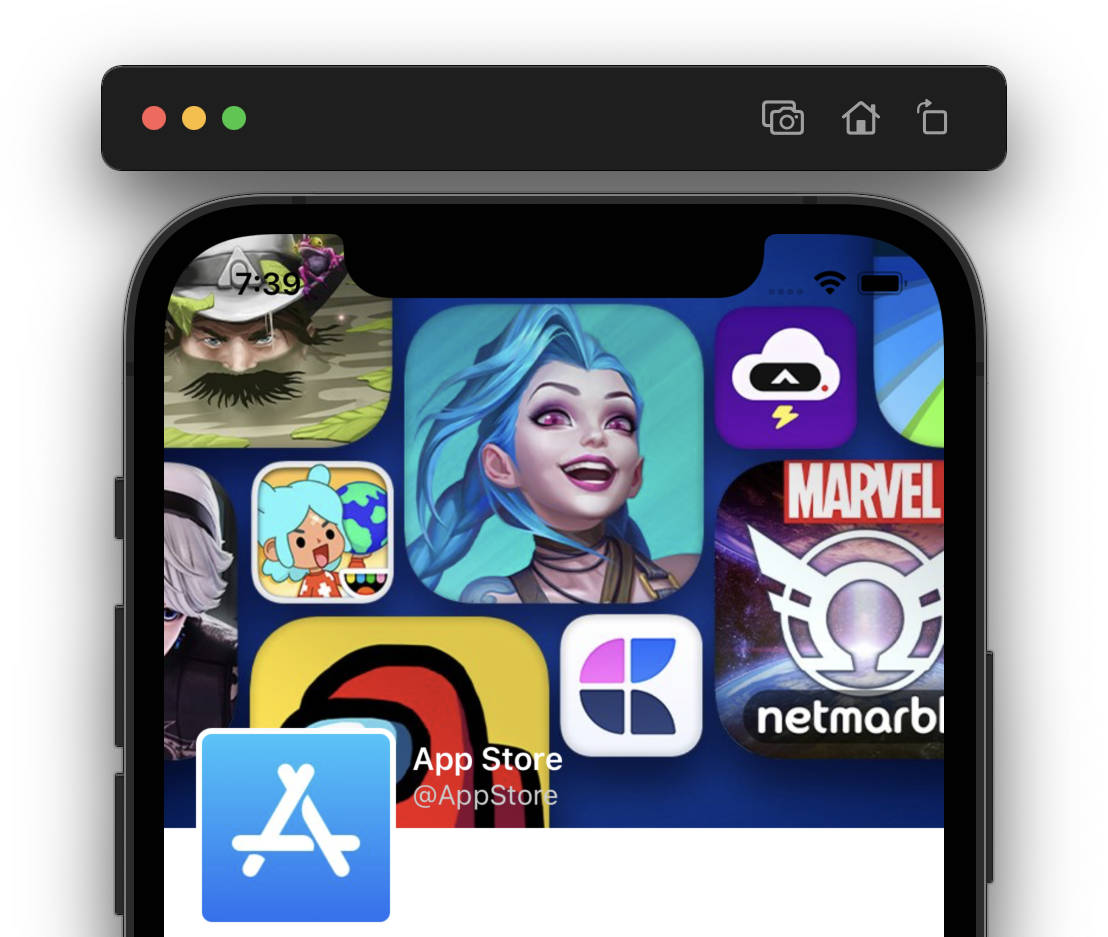
In this example we are going to build a sample Twitter profile page that displays account’s information such as the avatar and bio, number of followers and recent tweets. We will look at how to use UIScrollView and how to create the common "sticky header" that increases its height as the content is dragged down. The header is not a direct subview of the scroll view, though the end result will make it look as if it is.
Create a new iOS project in Xcode or open the starting project for this example, it is available on GitHub.
View model
Let’s start by defining our view model in a new file Models.swift. We’ll reuse the view model for the tweet from the previous example:
enum Tweet {
    enum User {
        struct ViewModel {
            let username: String
            let displayName: String
            let avatar: UIImage?
        }
    }

    enum Media {
        struct ViewModel {
            let image: UIImage?
            let size: CGSize
        }
    }

    struct ViewModel: Hashable {
        let id: UUID
        let date: String
        let author: Tweet.User.ViewModel
        let text: String?
        let media: Tweet.Media.ViewModel?
        let retweetedBy: Tweet.User.ViewModel?

        func hash(into hasher: inout Hasher) {
            hasher.combine(self.id)
        }

        static func == (lhs: Tweet.ViewModel, rhs: Tweet.ViewModel) -> Bool {
            return lhs.id == rhs.id
        }
    }
}
We’ll define TweetProfile enum to namespace the rest of the models and add IconButton model first. This view model will be used for the location and link buttons:
enum TwitterProfile {

    enum IconButton {
        struct ViewModel {
            let icon: String
            let title: String
        }
    }

}
We also add a view model for the user profile information such as the display name, avatar, and so on:
enum TwitterProfile {
    ...

    enum User {
        struct ViewModel {
            let username: String
            let displayName: String
            let bio: String
            let location: IconButton.ViewModel
            let url: IconButton.ViewModel
            let followers: String
            let following: String
            let avatar: UIImage?
        }
    }
}
This is all the information the profile view will display, so we create a view model for that:
enum TwitterProfile {
    ...

    struct ViewModel {
        let user: TwitterProfile.User.ViewModel
        let tweets: [Tweet.ViewModel]
    }
}
Finally we’ll create some sample data to work with:
enum SampleModel {
private static let user = Tweet.User.ViewModel(username: "@AppStore", displayName: "App Store", avatar: UIImage(named: "avatar"))
private static let tweets: [Tweet.ViewModel] = [
Tweet.ViewModel(id: UUID(), date: "4h", author: SampleModel.user, text: "Prepare for a trip into the underworld! 😈", media: Tweet.Media.ViewModel(image: UIImage(named: "tweet1"), size: CGSize(width: 315, height: 315)), retweetedBy: nil),
Tweet.ViewModel(id: UUID(), date: "8h", author: SampleModel.user, text: "\"We’re trying to use astrology as a jumping-off point for a new kind of reality.\" ✨", media: nil, retweetedBy: nil),
Tweet.ViewModel(id: UUID(), date: "14h", author: SampleModel.user, text: nil, media: Tweet.Media.ViewModel(image: UIImage(named: "tweet3"), size: CGSize(width: 514, height: 315)), retweetedBy: nil),
Tweet.ViewModel(id: UUID(), date: "16h", author: SampleModel.user, text: "2022 is the year you rethink what yoga can do. 🧘♀️\n\nAsana Rebel is a yoga-inspired workout app that caters to all fitness levels.", media: nil, retweetedBy: nil)
]
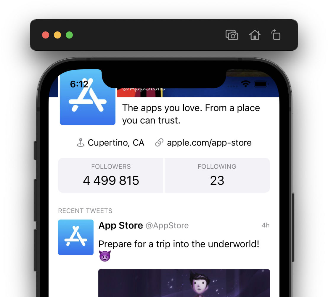
static let profile = TwitterProfile.ViewModel(user: TwitterProfile.User.ViewModel(username: SampleModel.user.username, displayName: SampleModel.user.displayName, bio: "The apps you love. From a place you can trust.", location: TwitterProfile.IconButton.ViewModel(icon: "mappin.and.ellipse", title: "Cupertino, CA"), url: TwitterProfile.IconButton.ViewModel(icon: "link", title: "apple.com/app-store"), followers: "4 499 815", following: "23", avatar: SampleModel.user.avatar), tweets: SampleModel.tweets)
}NSLayoutConstraint extension
As part of the setup, let’s also create an extension for NSLayoutConstraint that we’ll use later when creating optional constraints. In a new file Extensions.swift paste the following code:
import UIKit

extension NSLayoutConstraint {

    func withPriority(_ priority: UILayoutPriority) -> NSLayoutConstraint {
        self.priority = priority
        return self
    }

}
TwitterProfileView
Next we’ll create a new file TwitterProfileView.swift and add a subclass of UIView. This view will contain the header and scroll view:
class TwitterProfileView: UIView {

    init() {
        super.init(frame: .zero)

        self.setupView()
    }

    required init?(coder: NSCoder) {
        fatalError("init(coder:) has not been implemented")
    }

    private func setupView() {

    }

}
For now we’ll keep it empty and return to the root view controller to initialize the view:
private let profileView = TwitterProfileView()

...


override func viewDidLoad() {
    super.viewDidLoad()

    self.profileView.translatesAutoresizingMaskIntoConstraints = false
    self.view.addSubview(self.profileView)

    NSLayoutConstraint.activate([
        self.profileView.leadingAnchor.constraint(equalTo: self.view.leadingAnchor),
        self.profileView.trailingAnchor.constraint(equalTo: self.view.trailingAnchor),
        self.profileView.topAnchor.constraint(equalTo: self.view.topAnchor),
        self.profileView.bottomAnchor.constraint(equalTo: self.view.bottomAnchor)
    ])
}
It’s a very straightforward setup, we simply pin the view to all the edges of the view controller’s view. We are not using the safe area or the layout margins guide since we want the header to reach into the safe area. And as we’ll see later the scroll view is actually capable of doing some work for us to make the content appear within the safe area automatically.
Creating header & scroll view
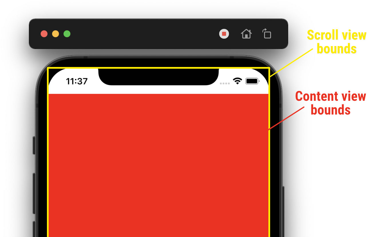
We can jump into TwitterProfileView.swift and start working on the layout. When using a scroll view, the best practice is to use a single view as its subview (often referred to as the content view). Any views to be displayed within the scroll view are added to the content view, not the scroll view itself. However, the header is not considered part of the content and as such it is placed outside of the scroll view. We only want the content view to determine the size of the scroll view.
Let’s begin by adding the header, scroll view and content view to our container view. We add the views as member properties and initialize their properties in the setupView method. We are setting custom layout margins to increase the default ones slightly. These will be used for the compact size class only as we’ll see later:
private let headerView = UIImageView(image: UIImage(named: "header"))
private let scrollView = UIScrollView()
private let contentView = UIView()

...

private func setupView() {
    self.headerView.contentMode = .scaleAspectFill
    self.headerView.translatesAutoresizingMaskIntoConstraints = false
    self.addSubview(self.headerView)

    self.scrollView.alwaysBounceVertical = true
    self.scrollView.translatesAutoresizingMaskIntoConstraints = false
    self.scrollView.layoutMargins = UIEdgeInsets(top: 0, left: 16, bottom: 0, right: 16)
    self.addSubview(self.scrollView)

    self.contentView.translatesAutoresizingMaskIntoConstraints = false
    self.scrollView.addSubview(self.contentView)
}self (the container view), not the scroll view.
We have not added any constraints yet because we first want to calculate the header’s size. Our header’s image size is 1500x500 pixels. If the screen of the device is wider, the header will need to be stretched horizontally which means its height will also increase since we want to keep the aspect ratio of the image:
We need to wait until the size of the TwitterProfileView is initialized to calculate the correct header’s height. We do that by waiting for the first layout pass:
private var isInitialized: Bool = false

...

override func layoutSubviews() {
    super.layoutSubviews()

    if !self.isInitialized {
        self.isInitialized = true

        self.updateConstraints(for: self.bounds.size)
    }
}

func updateConstraints(for size: CGSize) {

}
Switch to the view controller file for a moment, override viewWillTransition and call the updateConstraints method when the root view size changes:
override func viewWillTransition(to size: CGSize, with coordinator: UIViewControllerTransitionCoordinator) {
super.viewWillTransition(to: size, with: coordinator)
self.profileView.updateConstraints(for: size)
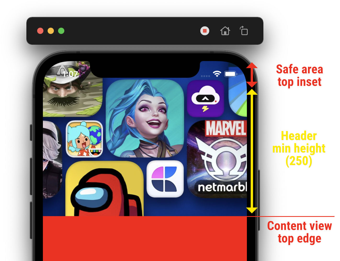
}Back in TwitterProfileView.swift we’ll define a minimum height for the header of 250 points. This will serve as the base value for the calculation of the header’s height:
private let headerMinHeight: CGFloat = 250To calculate the height, we take the ratio of the view’s width to the image’s natural width. We make sure the ratio is never less than one, to satisfy our minimum header height requirement:
func updateConstraints(for size: CGSize) {
    let headerHeight: CGFloat = max(1, (size.width / 750)) * self.headerMinHeight
}
We can now start creating our constraints. Since the constraints may need to be updated during runtime, we’ll add a member property to store them:
private var activeConstraints: [NSLayoutConstraint] = []Whenever the updateConstraints method is called we need to deactivate any currently active constraints:
func updateConstraints(for size: CGSize) {
    ...

    NSLayoutConstraint.deactivate(self.activeConstraints)
    self.activeConstraints.removeAll()
}
We begin by constraining the scroll view to all the edges of the superview, simply because we want it to cover the entire area. We add the constraints to the activeConstraints array for now, we’ll activate them later:
func updateConstraints(for size: CGSize) {
    ...

    self.activeConstraints.append(contentsOf: [
        self.scrollView.leadingAnchor.constraint(equalTo: self.leadingAnchor),
        self.scrollView.trailingAnchor.constraint(equalTo: self.trailingAnchor),
        self.scrollView.topAnchor.constraint(equalTo: self.topAnchor),
        self.scrollView.bottomAnchor.constraint(equalTo: self.bottomAnchor)
    ])
}
The constraints for the content view will differ depending on the current size class. To constrain the width of the content, we’ll use the scroll view’s readable content guide for regular size class to make the content easier to digest. This layout guide defines an area that can easily be read without forcing users to move their head to track the lines. For compact size class, we’ll use the layout margins guide:
func updateConstraints(for size: CGSize) {
    ...

    let isRegular = self.traitCollection.horizontalSizeClass == .regular
    let contentGuide = isRegular ? self.scrollView.readableContentGuide : self.scrollView.layoutMarginsGuide

    self.activeConstraints.append(contentsOf: [
        self.contentView.leadingAnchor.constraint(equalTo: contentGuide.leadingAnchor),
        self.contentView.trailingAnchor.constraint(equalTo: contentGuide.trailingAnchor),
        self.contentView.widthAnchor.constraint(equalTo: contentGuide.widthAnchor),
        self.contentView.topAnchor.constraint(equalTo: self.scrollView.topAnchor),
        self.contentView.bottomAnchor.constraint(equalTo: self.scrollView.bottomAnchor)
    ])
}
The leading, trailing and width anchors are constrained to the respective layout guide while the top and bottom anchors are pinned directly to the scroll view. We should always pin all of the content’s edges to the scroll view to ensure proper scrolling behavior. Note we set the width explicitly to ensure our content does not scroll horizontally. The height of the content can vary which will result in vertical scrolling.
Sticky header
Before constraining our header, let’s take a look at scroll view’s content inset adjustment behavior. When a scroll view’s bounds reach outside of the safe area, it automatically insets the content to make it appear within the safe area when the scroll position is at (0, 0):
This behavior can be changed using the contentInsetAdjustmentBehavior property:
scrollView.contentInsetAdjustmentBehavior = .neverIn our case we’ll keep this behavior set to the default value of automatic, this is just a quick side note to realize it exists.
Let’s try to describe the layout of the header and see if we can deduct the constraints from that:
- The width should match that of the container view, i.e. it should span from the leading to the trailing edge.
- It should appear above the content view, i.e. its bottom edge should always be above the content's top edge.
- The top edge should never be below the container's top edge, i.e. the header can be pushed away upwards but it should stick at the top when fully visible.
- The height of the header should always be at least the size that we calculate, i.e. it can grow if needed when pulling the content down.
Since we want our header to reach outside the safe area as well, we’ll need to factor in the safe area top inset into the total height of the header to ensure the header’s bottom edge lines up precisely with the content’s top edge:
With these requirements in place, the constraints could be as follows:
func updateConstraints(for size: CGSize) {
    ...

    self.activeConstraints.append(contentsOf: [
        self.headerView.leadingAnchor.constraint(equalTo: self.leadingAnchor), // (1)
        self.headerView.trailingAnchor.constraint(equalTo: self.trailingAnchor), // (1)
        self.headerView.bottomAnchor.constraint(equalTo: self.contentView.topAnchor), // (2)
        self.headerView.topAnchor.constraint(lessThanOrEqualTo: self.scrollView.topAnchor), // (3)
        self.headerView.heightAnchor.constraint(equalToConstant: headerHeight + self.safeAreaInsets.top).withPriority(.defaultHigh), // (4)
        self.headerView.heightAnchor.constraint(greaterThanOrEqualToConstant: headerHeight + self.safeAreaInsets.top), // (4)
    ])
}- We fix both the width and horizontal position using the leading and trailing constraints.
- The vertical position is fixed by constraining the bottom anchor of the header.
- The top anchor uses inequality to allow the header be pushed away when going upwards but never below the scroll view's top edge.
- The height is fixed using an optional constraint with the constant we calculated earlier and adding the safe area inset to that. It must be optional because we want the header to grow taller when pulling the content down. To describe this behavior we use another inequality constraint for the height.
Now that we’ve laid out the header, we need to inset the content view from the top of the scroll view to make room for the header, otherwise the content would cover the header. Fortunately scroll view supports this behavior out of the box with the contentInset property. By setting the content inset, the content view will be pushed down from the top edge of the scroll view:
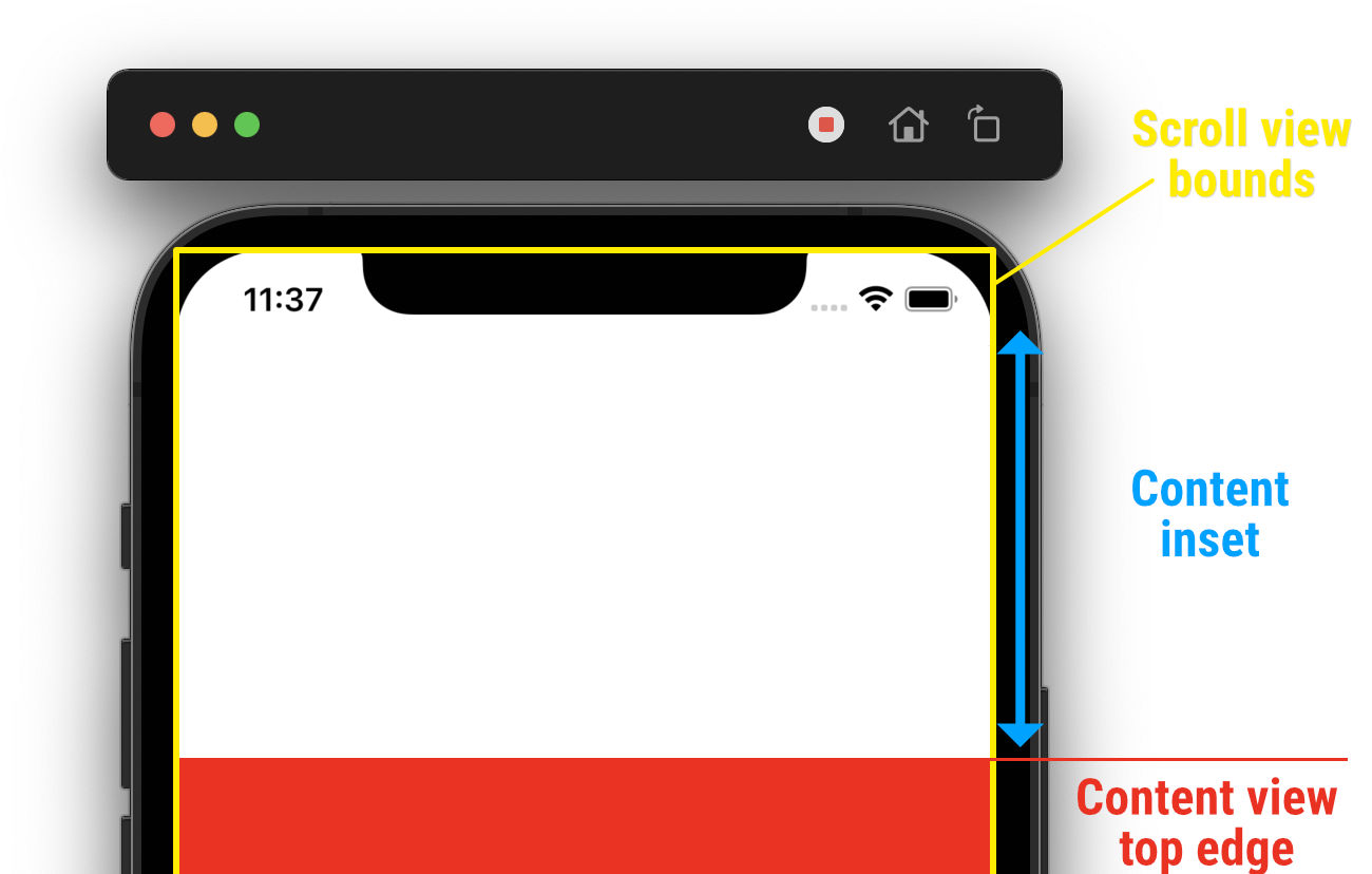
We use the calculated header height as the top inset and activate the constraints:
func updateConstraints(for size: CGSize) {
    ...

    self.scrollView.contentInset = UIEdgeInsets(top: headerHeight, left: 0, bottom: 0, right: 0)

    NSLayoutConstraint.activate(self.activeConstraints)
}
We can now build and run the project to see our sticky header in action. Of course we do not have any content yet so there is nothing to scroll:
Creating profile UI
With the base constraints setup, we can now get to building the main portion of the UI. Basically all of the views we are about to create will be added as subviews to the content view. The constraints for all views will remain the same throughout the lifecycle of the container view, so we can activate them right away.
Avatar view
Let’s start with the avatar view — we set some corner radius along with a small border and set the constraints:
private let avatarView = UIImageView()

...

private func setupView() {
    ...

    self.avatarView.translatesAutoresizingMaskIntoConstraints = false
    self.avatarView.layer.masksToBounds = true
    self.avatarView.layer.cornerRadius = 8
    self.avatarView.layer.borderWidth = 3
    self.avatarView.layer.borderColor = UIColor.systemBackground.cgColor
    self.contentView.addSubview(self.avatarView)

    NSLayoutConstraint.activate([
        self.avatarView.leadingAnchor.constraint(equalTo: self.contentView.leadingAnchor), // (1)
        self.avatarView.centerYAnchor.constraint(equalTo: self.contentView.topAnchor), // (2)
        self.avatarView.widthAnchor.constraint(equalToConstant: 100), // (3)
        self.avatarView.heightAnchor.constraint(equalToConstant: 100) // (3)
    ])
}- The leading edge is pinned to the content view.
- The vertical center of the avatar is pinned to the top of the content so that half of the avatar reaches out into the header.
- The size is fixed to a constant of
100.
User name label
We continue on with the user name label that should appear next to the header just above the content view:
private let userNameLabel = UILabel()

...

private func setupView() {
    ...

    self.userNameLabel.translatesAutoresizingMaskIntoConstraints = false
    self.userNameLabel.font = UIFont.preferredFont(forTextStyle: .subheadline)
    self.userNameLabel.textColor = UIColor(white: 0.8, alpha: 1) // (1)
    self.userNameLabel.setContentHuggingPriority(.defaultLow - 1, for: .horizontal) // (2)
    self.userNameLabel.setContentCompressionResistancePriority(.defaultLow, for: .horizontal) // (2)
    self.contentView.addSubview(self.userNameLabel)

    NSLayoutConstraint.activate([
        self.userNameLabel.leadingAnchor.constraint(equalTo: self.avatarView.trailingAnchor, constant: 8), // (3)
        self.userNameLabel.trailingAnchor.constraint(equalTo: self.contentView.trailingAnchor), // (4)
        self.userNameLabel.bottomAnchor.constraint(equalTo: self.contentView.topAnchor, constant: -8) // (5)
    ])
}- The text color is set to light gray color. The color will not adapt to system's appearance, we want the color to stay the same at all times (we'll see why in a moment).
- We lower both the content hugging and compression resistance priorities to stretch and squeeze the label as needed (to keep the avatar view size intact).
- The leading edge is pinned to the trailing edge of the avatar view, making it appear right next to it.
- The trailing edge is pinned to the content view, thus the label is allowed to fill the remaining horizontal space available.
- The bottom anchor is pinned to the top anchor of the content, meaning it will appear above the content.
Display name label
The display name label is created similarly. We want it to appear next to the avatar above the user name label:
private let displayNameLabel = UILabel()

...

private func setupView() {
    ...

    self.displayNameLabel.translatesAutoresizingMaskIntoConstraints = false
    self.displayNameLabel.font = UIFont.preferredFont(forTextStyle: .headline)
    self.displayNameLabel.textColor = .white // (1)
    self.displayNameLabel.setContentHuggingPriority(.defaultLow - 1, for: .horizontal) // (2)
    self.displayNameLabel.setContentCompressionResistancePriority(.defaultLow, for: .horizontal) // (2)
    self.contentView.addSubview(self.displayNameLabel)

    NSLayoutConstraint.activate([
        self.displayNameLabel.leadingAnchor.constraint(equalTo: self.avatarView.trailingAnchor, constant: 8),
        self.displayNameLabel.trailingAnchor.constraint(equalTo: self.contentView.trailingAnchor),
        self.displayNameLabel.bottomAnchor.constraint(equalTo: self.userNameLabel.topAnchor) // (3)
    ])
}- Once again the color is set to a non-adapting color.
- Same as for the user name label, the priorities are lowered to avoid resizing the avatar.
- The bottom edge is pinned to the top edge of the user name label. The other constraints are the same as for the user name label.
At this point we can create an update method and start populating our views with the view model data:
func update(viewModel: TwitterProfile.ViewModel) {
    self.avatarView.image = viewModel.user.avatar
    self.displayNameLabel.text = viewModel.user.displayName
    self.userNameLabel.text = viewModel.user.username
}
We’ll define the sample view model back in the root view controller and call the update method on the profile view:
private let viewModel: TwitterProfile.ViewModel = SampleModel.profile

...

override func viewDidLoad() {
    ...

    self.profileView.update(viewModel: self.viewModel)

    ...
}
Build and run the project to see the current work in progress:
The views are laid out correctly, however the text is a bit difficult to read. Let’s add a dark gradient to the header to darken the background near the labels while not covering the header image too much.
Gradient view
We’ll create a new subclass of UIView for this purpose:
class GradientView: UIView {

    // (1)
    override class var layerClass: AnyClass {
        return CAGradientLayer.self
    }

    init() {
        super.init(frame: .zero)

        self.setupView()
    }

    required init?(coder: NSCoder) {
        fatalError("init(coder:) has not been implemented")
    }

    private func setupView() {
        self.translatesAutoresizingMaskIntoConstraints = false

        // (2)
        let layer = self.layer as! CAGradientLayer
        layer.colors = [UIColor.black.withAlphaComponent(0).cgColor, UIColor.black.cgColor]
    }

}- We override the view's layer and provide a reference to the
CAGradientLayerclass. The view will be backed by the gradient layer instead of the default plainCALayer. - We set the gradient colors from fully transparent black to fully opaque black, creating the gradient we need.
We don’t need to set any other gradient properties since the default ones work well for our use case. Now we can use this view in TwitterProfileView.swift and add it as a cover for the header view:
private func setupView() {
    // Header view is initialized here

    let gradientView = GradientView()
    self.addSubview(gradientView)

    NSLayoutConstraint.activate([
        gradientView.leadingAnchor.constraint(equalTo: self.headerView.leadingAnchor),
        gradientView.trailingAnchor.constraint(equalTo: self.headerView.trailingAnchor),
        gradientView.topAnchor.constraint(equalTo: self.headerView.topAnchor),
        gradientView.bottomAnchor.constraint(equalTo: self.headerView.bottomAnchor)
    ])
}
We pin all the gradient’s edges to the header’s edges to match it perfectly. The gradient now makes it much easier to read the text inside the header. Feel free to play around with the opacity of the gradient:
Bio label
Next view is the bio label that should appear next to the avatar just below the top of the content view:
private let bioLabel = UILabel()

...

private func setupView() {
    ...

    // Description label
    self.bioLabel.translatesAutoresizingMaskIntoConstraints = false
    self.bioLabel.font = UIFont.preferredFont(forTextStyle: .body)
    self.bioLabel.textColor = .label
    self.bioLabel.numberOfLines = 2 // (1)
    self.bioLabel.setContentHuggingPriority(.defaultLow - 1, for: .horizontal)
    self.bioLabel.setContentCompressionResistancePriority(.defaultLow, for: .horizontal)
    self.contentView.addSubview(self.bioLabel)

    NSLayoutConstraint.activate([
        self.bioLabel.leadingAnchor.constraint(equalTo: self.avatarView.trailingAnchor, constant: 8),
        self.bioLabel.trailingAnchor.constraint(equalTo: self.contentView.trailingAnchor),
        self.bioLabel.topAnchor.constraint(equalTo: self.contentView.topAnchor, constant: 8) // (2)
    ])
}- We limit the label to two lines.
- The constraints are very similar to previous labels, except that the top anchor aligns with the top anchor of the content view (plus a standard amount of space).
Location and link
Next we want to display the location and link buttons and arrange them horizontally:
We create a horizontal stack view and add the buttons to it:
private let locationButton = UIButton(type: .system)
private let urlButton = UIButton(type: .system)

...

private func setupView() {
    ...

    let stack = UIStackView()
    stack.translatesAutoresizingMaskIntoConstraints = false
    stack.axis = .horizontal
    stack.spacing = 16
    self.contentView.addSubview(stack)

    NSLayoutConstraint.activate([
        stack.leadingAnchor.constraint(greaterThanOrEqualTo: self.contentView.leadingAnchor), // (1)
        stack.trailingAnchor.constraint(lessThanOrEqualTo: self.contentView.trailingAnchor), // (2)
        stack.centerXAnchor.constraint(equalTo: self.contentView.centerXAnchor), // (2)
        stack.topAnchor.constraint(equalTo: self.avatarView.bottomAnchor, constant: 16) // (3)
    ])

    self.locationButton.tintColor = .label
    stack.addArrangedSubview(self.locationButton)

    self.urlButton.tintColor = .label
    stack.addArrangedSubview(self.urlButton)
}
- The leading and trailing anchors use inequality to avoid stretching the stack view when it's not needed. The stack view will take on the size of its subviews and only be limited to the width of the content view when necessary.
- The horizontal position is fixed to the center of the content view.
- The top edge is pinned to the bottom of the avatar.
We’ll create another method to set the button’s properties from the view model:
private func updateButton(_ button: UIButton, viewModel: TwitterProfile.IconButton.ViewModel) {
    button.setTitle(viewModel.title, for: .normal)
    button.titleLabel?.font = UIFont.preferredFont(forTextStyle: .caption1)

    button.imageEdgeInsets = UIEdgeInsets(top: 0, left: 0, bottom: 0, right: 8)
    button.titleEdgeInsets = UIEdgeInsets(top: 0, left: 8, bottom: 0, right: -8)
    button.contentEdgeInsets = UIEdgeInsets(top: 0, left: 8, bottom: 0, right: 8)

    let config = UIImage.SymbolConfiguration(scale: .small)
    let image = UIImage(systemName: viewModel.icon, withConfiguration: config)
    button.setImage(image, for: .normal)
}
We then call this method for each button in the update method:
func update(viewModel: TwitterProfile.ViewModel) {
    ...

    self.updateButton(self.locationButton, viewModel: viewModel.user.location)
    self.updateButton(self.urlButton, viewModel: viewModel.user.url)
}
Twitter followers view
This view will display the number of followers and followings the profile has. It’s simply a horizontal stack view with two vertical stacks of labels, with a border through the middle:
Start off by creating a new subclass of UIView:
class TwitterFollowersView: UIView {

    init() {
        super.init(frame: .zero)

        self.setupView()
    }

    required init?(coder: NSCoder) {
        fatalError("init(coder:) has not been implemented")
    }

    private func setupView() {

    }

}TwitterFollowersView does not subclass UIStackView directly because we want to use a background color. Stack views support background color only since iOS 14.
We’ll use a horizontal stack view to arrange the content (the vertical stacks) and pin its edges to the superview. We also add custom layout margins on the stack view and enable the isLayoutMarginsRelativeArrangement property to have the subviews laid out relative to the stack view’s layout margins, creating a bit of a vertical whitespace. The stack view uses fillEqually distribution to have the arranged subviews sized equally:
private let contentStack = UIStackView()

...

private func setupView() {
    self.translatesAutoresizingMaskIntoConstraints = false
    self.backgroundColor = .secondarySystemBackground
    self.layer.cornerRadius = 8

    self.contentStack.axis = .horizontal
    self.contentStack.distribution = .fillEqually
    self.contentStack.translatesAutoresizingMaskIntoConstraints = false
    self.contentStack.layoutMargins = UIEdgeInsets(top: 8, left: 0, bottom: 8, right: 0)
    self.contentStack.isLayoutMarginsRelativeArrangement = true
    self.addSubview(self.contentStack)

    NSLayoutConstraint.activate([
        self.contentStack.leadingAnchor.constraint(equalTo: self.leadingAnchor),
        self.contentStack.trailingAnchor.constraint(equalTo: self.trailingAnchor),
        self.contentStack.topAnchor.constraint(equalTo: self.topAnchor),
        self.contentStack.bottomAnchor.constraint(equalTo: self.bottomAnchor)
    ])
}
Let’s also add a vertical border through the middle to have some visual separation between the number of followers and followings:
private func setupView() {
    ...

    let border = UIView()
    border.translatesAutoresizingMaskIntoConstraints = false
    border.backgroundColor = .systemBackground
    self.addSubview(border)

    NSLayoutConstraint.activate([
        border.widthAnchor.constraint(equalToConstant: 2),
        border.topAnchor.constraint(equalTo: self.topAnchor),
        border.bottomAnchor.constraint(equalTo: self.bottomAnchor),
        border.centerXAnchor.constraint(equalTo: self.centerXAnchor)
    ])
}
Next we’ll add a method to create a vertical stack of two labels — title and value. We’ll then use two of these stacks to display the number of followers and followings the twitter profile has:
private func addLabelsStack(title: String, value: String) {
    let stack = UIStackView()
    stack.axis = .vertical
    stack.spacing = 4
    stack.alignment = .center
    self.contentStack.addArrangedSubview(stack)

    let titleLabel = UILabel()
    titleLabel.font = UIFont.preferredFont(forTextStyle: .subheadline)
    titleLabel.textColor = .secondaryLabel
    titleLabel.text = title
    stack.addArrangedSubview(titleLabel)

    let valueLabel = UILabel()
    valueLabel.font = UIFont.preferredFont(forTextStyle: .title2)
    valueLabel.textColor = .label
    valueLabel.text = value
    stack.addArrangedSubview(valueLabel)
}
Finally we add update method to create the two labels stack. We remove any previous content first to be able to update an existing view:
func update(followers: String, following: String) {
    for view in self.contentStack.arrangedSubviews {
        view.removeFromSuperview()
    }

    self.addLabelsStack(title: "FOLLOWERS", value: followers)
    self.addLabelsStack(title: "FOLLOWING", value: following)
}
Let’s go back to TwitterProfileView.swift and add the followers view:
private let followersView = TwitterFollowersView()We add the view to the hierarchy and create its constraints at the bottom of the setupView method. The view is pinned to the leading and trailing edges of the content view and the top is pinned to the bottom of the location/url labels stack:
private func setupView() {
    ...

    self.contentView.addSubview(self.followersView)

    NSLayoutConstraint.activate([
        self.followersView.leadingAnchor.constraint(equalTo: self.contentView.leadingAnchor),
        self.followersView.trailingAnchor.constraint(equalTo: self.contentView.trailingAnchor),
        self.followersView.topAnchor.constraint(equalTo: stack.bottomAnchor, constant: 16)
    ])
}
Recent tweets
The last portion of the layout is made up of recent tweets where we’ll reuse the code we’ve created in the previous example. However we won’t be using a table view to display the recent tweets, since we only want to display four tweets. Instead we’ll create four tweet views and a stack view for vertical arrangement.
We create a new file called TweetView.swift and copy and paste the contents of TweetTableViewCell.swift from the previous example. We rename the class from TweetTableViewCell to TweetView and make it a subclass of UIView:
class TweetView: UIView {

    ...

}
Several errors have popped up now that we’ve changed the subclass. Let’s fix those one by one:
- Remove the cell style initializer and replace it with a new one:
init() { super.init(frame: .zero) self.setupView() } - Remove the
self.selectionStyle = .noneline at the top of thesetupViewmethod. - Replace any reference to
self.contentViewwithself. - Remove the
NSLayoutConstraintextension at the bottom of the file. - We can remove any reference to
RetweetedByViewsince our tweets in this example will only display tweets authored by the profile, no retweets. Thus we can remove the variable at the top and the methods that reference the view:private var retweetedByView: RetweetedByView? ... private func update(viewModel: Tweet.ViewModel) { ... if let retweet = viewModel.retweetedBy { self.addRetweetedByView(retweet) } else { self.removeRetweetedByView() } } ... private func addRetweetedByView(_ user: Tweet.User.ViewModel) { if self.retweetedByView == nil { self.retweetedByView = RetweetedByView() self.contentStack.addArrangedSubview(self.retweetedByView!) } self.retweetedByView?.update(viewModel: user) } private func removeRetweetedByView() { guard let view = self.retweetedByView else { return } view.removeFromSuperview() self.retweetedByView = nil }
After all these changes the view now contains no errors. We’ll create a stack view subclass to hold a title label and the tweet views:
class TweetsStackView: UIStackView {

    init() {
        super.init(frame: .zero)

        self.setupView()
    }

    required init(coder: NSCoder) {
        fatalError("init(coder:) has not been implemented")
    }

    private func setupView() {

    }

}
We only need to set the axis, spacing and disable the autoresizing mask:
private func setupView() {
    self.axis = .vertical
    self.spacing = 16
    self.translatesAutoresizingMaskIntoConstraints = false
}
We’ll add the title label and initialize its properties. We also decrease the spacing somewhat after the title:
private let titleLabel = UILabel()

...

private func setupView() {
    ...

    self.titleLabel.font = UIFont.preferredFont(forTextStyle: .caption1)
    self.titleLabel.textColor = .secondaryLabel
    self.titleLabel.text = "RECENT TWEETS"
    self.addArrangedSubview(self.titleLabel)
    self.setCustomSpacing(8, after: self.titleLabel)
}
Finally we add an update method to populate our view with the tweets:
func update(tweets: [Tweet.ViewModel]) {
    // (1)
    for view in self.arrangedSubviews {
        if view is TweetView {
            view.removeFromSuperview()
        }
    }

    // (2)
    tweets.forEach { tweet in
        let view = TweetView()
        view.update(viewModel: tweet)
        self.addArrangedSubview(view)
    }
}- We remove any previous tweet views to avoid any reuse issues.
- We loop through the provided tweets and create a new view for each one.
Once again we return to TweetProfileView.swift and add our tweets stack view:
private let tweetsStack = TweetsStackView()We add the view to the hierarchy at the end of the setupView method and initialize its constraints:
private func setupView() {
    ...

    self.contentView.addSubview(self.tweetsStack)

    NSLayoutConstraint.activate([
        self.tweetsStack.leadingAnchor.constraint(equalTo: self.contentView.leadingAnchor), // (1)
        self.tweetsStack.trailingAnchor.constraint(equalTo: self.contentView.trailingAnchor), // (1)
        self.tweetsStack.topAnchor.constraint(equalTo: self.followersView.bottomAnchor, constant: 16), // (2)
        self.tweetsStack.bottomAnchor.constraint(equalTo: self.contentView.bottomAnchor) // (3)
    ])
}- Leading and trailing constraints are pinned to the content view, making the stack span across the entire width.
- The top is pinned to the bottom of the
followersView. - Since this is the last view we must pin the bottom anchor to the bottom of the content view to ensure the content is sized correctly and the scroll view is able to determine how much scrolling is necessary.
As always we must remember to update the view with the view model:
func update(viewModel: TwitterProfile.ViewModel) {
    ...

    self.tweetsStack.update(tweets: viewModel.tweets)
}
We can now build and run to see our final layout. What we can notice is that the initial content offset (scroll position) makes the content view appear at the top of the scroll view’s safe area, hiding our header:
This is caused by the contentInset property we set in the updateConstraints method earlier. We need to manually calculate the initial content offset to make sure our header appears within the view initially. Let’s go back to the updateConstraints method to where the content inset is set and fix this:
var offset = self.scrollView.contentOffset
offset.y += self.scrollView.contentInset.top - headerHeight
self.scrollView.setContentOffset(offset, animated: false)

// Content inset must be set after
self.scrollView.contentInset = UIEdgeInsets(top: headerHeight, left: 0, bottom: 0, right: 0)
Run the project again to see that the initial scrolling position now makes the header appear correctly.
Final touch
When we run the project and switch the system appearance (for example from light to dark), we’ll notice that the border around the avatar does not change. This is because the adaptive colors do not work with CGColor objects and the border uses that. We can fix this by overriding the traitCollectionDidChange method, observing changes to the user interface style (light/dark mode) and re–applying the border color:
override func traitCollectionDidChange(_ previousTraitCollection: UITraitCollection?) {
    super.traitCollectionDidChange(previousTraitCollection)

    if previousTraitCollection?.userInterfaceStyle != self.traitCollection.userInterfaceStyle {
        self.avatarView.layer.borderColor = UIColor.systemBackground.cgColor
    }
}
This concludes our layout for this example! We could improve the design further by including separators between the tweet views, but I’ll leave that as an excercise for those who wish to venture on their own. 😉
Source code
Complete source code for this and all the other examples is available on GitHub.
Where to next
- Intro
- Basics, Part One
- Basics, Part Two
- Xcode Setup
- Sign Up Screen
- Stack Views
- Custom UIAlert
- Players Profile
- Twitter Timeline
- Twitter Profile (reading now)
- Music Album