In part two of the Auto Layout basics we’ll look at another essential concepts of Auto Layout, such as intrinsic content size, content hugging, size classes, and more. Make sure to read the introduction to layout constraints in part one, in case you missed it.
Contents
- Intrinsic content size
- Content hugging
- Compression resistance
- Size classes
- Layout guides (safe area, layout margins)
- Autoresizing mask
Intrinsic content size
Intrinsic, or in other words natural or inherent size, is a property available on all views. The property is of type CGSize that provides values for the width and height, representing the natural width and height of the view. Common views such as UILabel, UIButton or UIImageView define their intrinsic size to reflect the displayed image or text, font settings, and so on. Views with an intrinsic size do not require to have their size constraints to be set — Auto Layout will actually add those constraints for us by checking the view’s intrinsicContentSize property.
As the example below shows, we only need to explicitly set the position constraints for each view to achieve a valid layout:
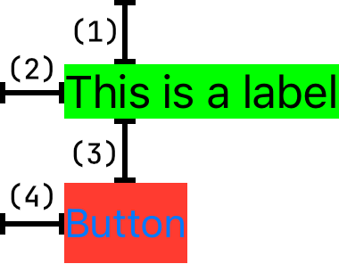
(1) label.top = superview.top + 24
(2) label.left = superview.left + 24
(3) button.top = label.bottom + 24
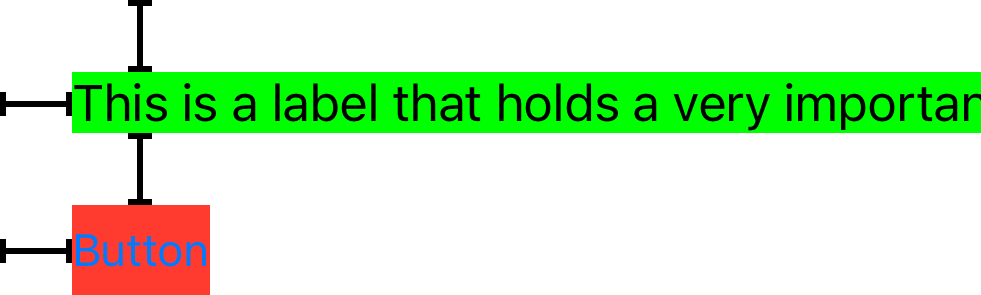
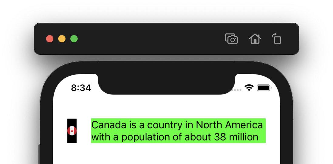
(4) button.left = superview.left + 24While this behavior is helpful, we need to be careful about it. If the label’s text were much longer, the label could expand way beyond the screen bounds since there are no constraints to limit its width:
It’s advised to have such scenarios covered by adding extra constraints, even though it may seem unnecessary at first. By adding the extra constraint to limit the label’s width, we allow the label to expand its height naturally and our layout becomes much more robust:
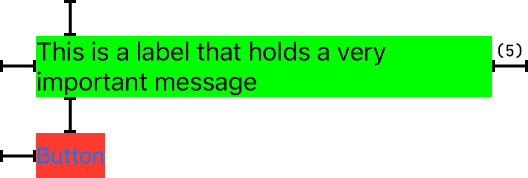
(5) label.right = superview.right - 24Views without intrinsic size
It goes without saying that some views do not have a natural size and we must specify the size constraints to have these views appear correctly. If we create an instance of UIView, it has no content by default and its intrinsic size is not defined. Though you might think the intrinsicContentSize property for such views would be (0, 0), it is not the case. Instead, UIKit defines UIView.noIntrinsicMetric constant that equals to -1. That’s simply for the views to say "hey, I do not have an intrinsic size for the given dimension (width or height)". Note the difference between this and for example a UILabel that is empty (it has no text set). The label’s intrinsic size in this case would in fact be (0, 0) which says "I do have an intrinsic size but it is 0 for both dimensions".
Now let’s consider a view like UIProgressView — commonly used for displaying a deterministic progress of a task (e.g. downloading a file). In this case, the intrinsic size is a little more interesting as the view has a natural height, but not the width and the intrinsicContentSize property has the value of (-1, 4). In other words, it is our job to set the width constraint explicitly, while we don’t have to worry about the height.

UIView subclasses can define their own intrinsic size by overriding the intrinsicContentSize property.
Content hugging
With our new knowledge on views with an intrinsic size, let’s tackle another problem that may arise when using views that provide their natural size. Imagine we want to arrange a couple of views horizontally (image and label in this case) in such a way that they make use of the entire space available minus some margin on the sides. The layout should look like the one pictured below:
(1) image.top = superview.top + 24
(2) image.left = superview.left + 24

(3) label.left = image.right + 24
(4) label.centerY = image.centerY
(5) label.right = superview.right - 24
We’ve achieved the layout using five constraints since both views have an intrinsic size and no size constraints are required. However, this setup is still ambiguous for Auto Layout. The constraints we defined can produce any of the two solutions below and we have to tell Auto Layout which of these we are looking for:
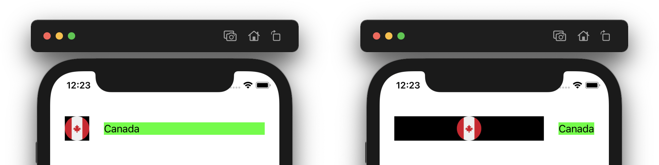
To provide this additional information for Auto Layout, we have to use content hugging priority. Adjusting this priority will fix the problem we’re dealing with here — the space available for the entire layout is bigger than what the views naturally occupy and Auto Layout needs to stretch one of them. The content hugging priority (set on each view) is what determines which view is to be stretched.
The priority is of type UILayoutPriority that is essentially a wrapper for a Float value in the range of 1-1000. Note the absolute value of the priority is not particularly important, the only thing that matters is that Auto Layout is able to find one and only one view with the lowest priority for a given layout. That view is then stretched to fill the available space.
Different views have different default priorities since some views are preferred to be stretched over others. For example, UISwitch has default priority of UILayoutPriority.defaultHigh (750), while UILabel has UILayoutPriority.defaultLow (250) — if we wanted to layout these two views similarly to the example above there would be no ambiguity and the label would be stretched by default. On the other hand the UIImageView we have in the example has the same defaultLow priority as the label and thus we have to explicitly adjust the priority to ensure we end up with the correct layout. This can be done using the setContentHuggingPriority() method:
let label = UILabel()
label.setContentHuggingPriority(UILayoutPriority.defaultLow - 1, for: NSLayoutConstraint.Axis.horizontal)
We simply decrease the label’s default priority by one to make it lower than that of the image view. This way Auto Layout knows we want it to stretch the label, which means there is only a single solution for our layout. Note we also specify the horizontal axis since we are laying out our views horizontally. The same priority concept applies to the vertical axis as well.
It does not have an effect on views without an intrinsic size.
Compression resistance
The concept of compression resistance aims to resolve a problem that is very much the opposite of content hugging. We use it when there is not enough space in the layout and one of the views has to be compressed to fit in. Once again, the view with the lowest priority is selected.
Going back to our earlier example, if we were to increase the amount of text in the label, incorrect compression resistance priorities could result in a broken layout:
We do not want the image to be compressed, therefore increasing the resistance priority for the image view fixes the layout. We use the setContentCompressionResistancePriority() method for this. The label’s numberOfLines property also needs to be set to zero to have the label span over multiple lines:
let image = UIImageView(image: ...)
image.setContentCompressionResistancePriority(UILayoutPriority.defaultHigh + 1, for: NSLayoutConstraint.Axis.horizontal)

let label = UILabel()
label.numberOfLines = 0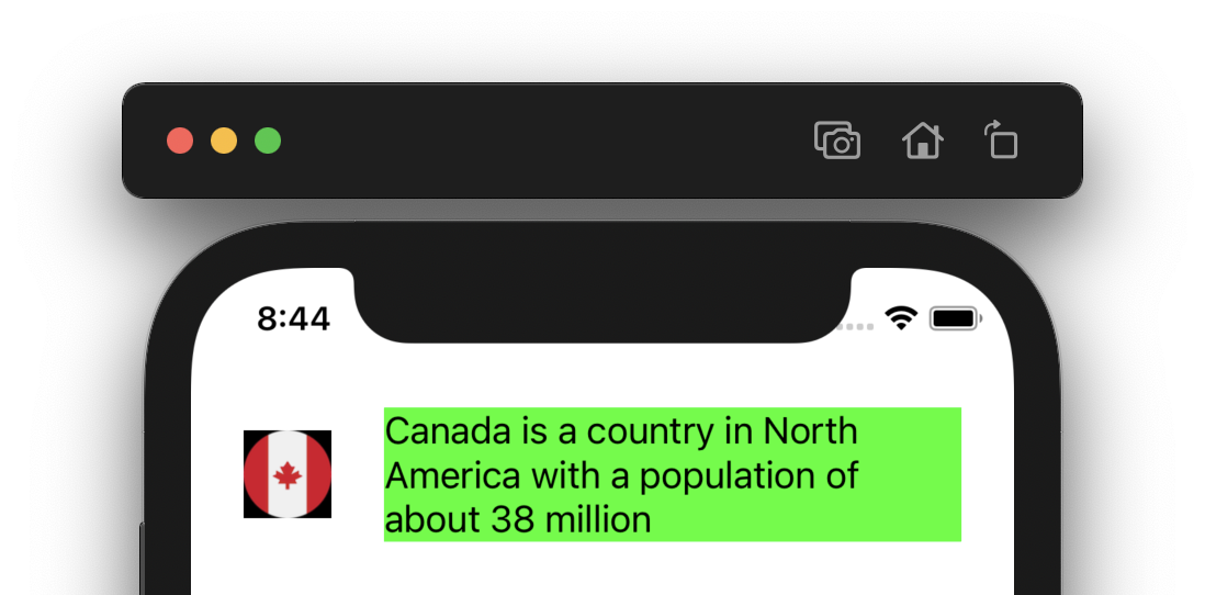
Once again, both the priority and axis must be specified since compression can affect vertical layouts as well. Note though that the default priority for compression resistance is defaultHigh for most views.
It does not have an effect on views without an intrinsic size.
For reference, default priorities for iOS views can be found in this table.
Size classes
To have our app provide the best user experience it should support all the various devices Apple makes. To accomplish this, our layouts have to adapt properly for all the different screen sizes, orientations and possibly even multitasking when using split view on iPads. Checking for all the possible combinations of these properties would be tedious when building the correct layout. Thankfully, the concept of size classes greatly simplifies the code we need to write to adapt to these changes readily.
A size class is a simple enum indicating whether our app is running in an environment with either a lot of screen space (e.g. an app running in full screen on an iPad) or a limited screen space (e.g. an iPhone mini):
- Regular size class — indicates an environment with a lot of screen space.
- Compact size class — indicates an environment with a limited screen space.
Size classes apply to both horizontal (width) and vertical (height) axis, that means we can easily encounter a situation where we have a compact width and regular height size classes at the same time (imagine holding an iPhone in portrait mode). We are freed from worrying about specific device screens or multitasking split views and rely purely on the size classes provided by the system. Let’s see how the size classes are defined for the various devices.
iPhones
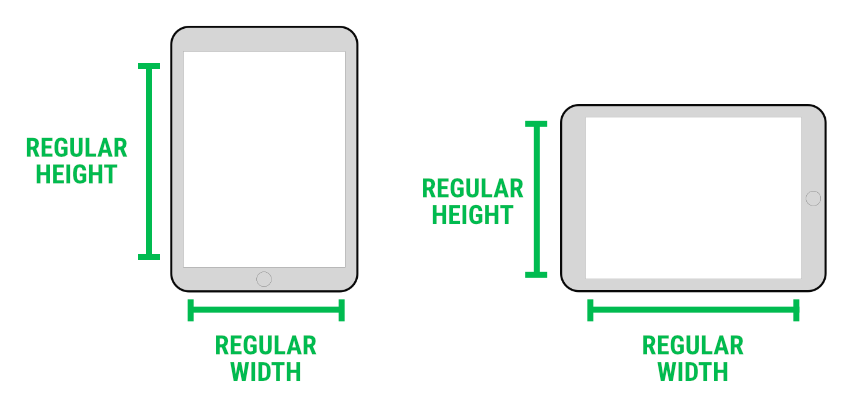
On iPhones, the possible values are simpler than on the iPad due to the lack of the multitasking feature. In portrait orientation, all iPhones have a regular height and compact width. It gets a little trickier in landscape as the iPhones are split into two groups:
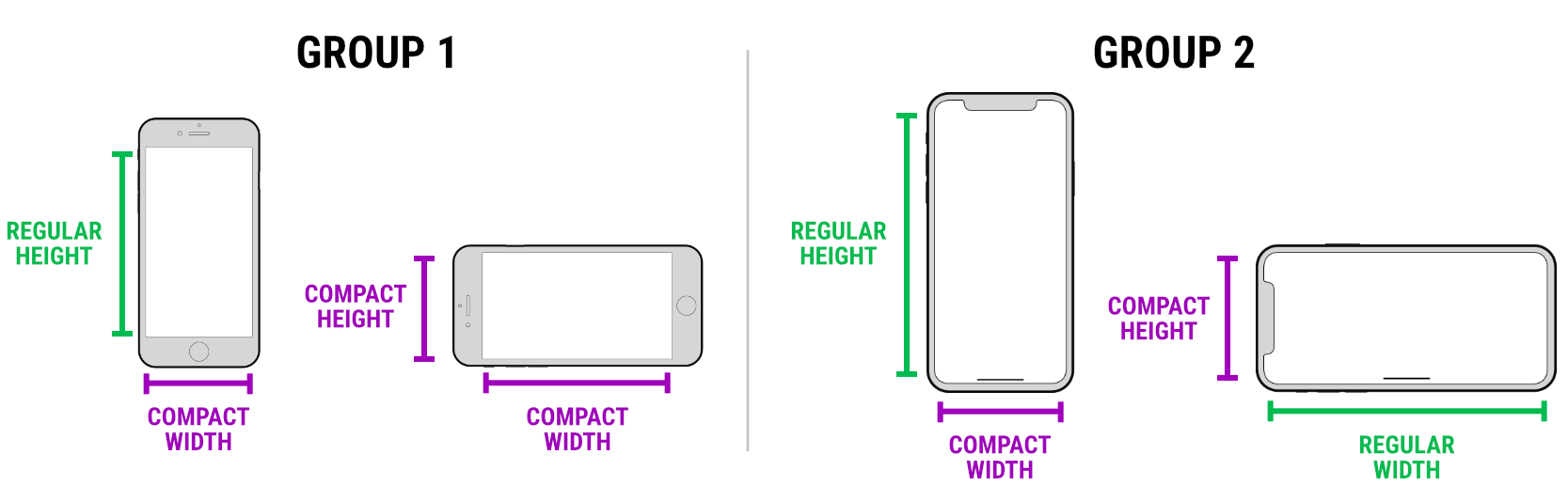
- Group 1 — in general, smaller iPhones belong to this group, including iPhone 12/13 and the 12/13 Pro models. These models have a compact width even in landscape orientation.
- Group 2 — in general, larger models have a regular width in landscape. These are all the Max and Plus models as well as the base iPhone 11 and iPhone XR.
iPads
Since iPads support multitasking by putting two apps on the screen side by side, there are a few more cases to remember compared to iPhones, so let’s have a look.
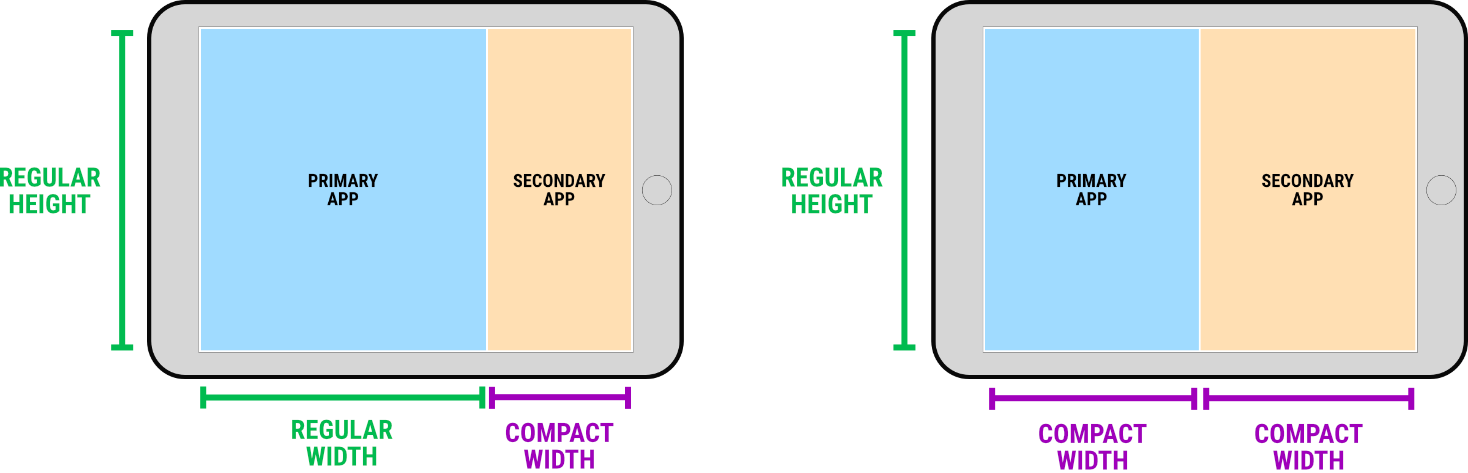
First up, when an app is running in full screen, it has both regular width and height on all iPads:
When using the slide over (apps split to roughly 67% and 33%), the primary app ends up with a regular width whereas the other one will have a compact width. When using the split view (apps split evenly), both apps will have a compact width:
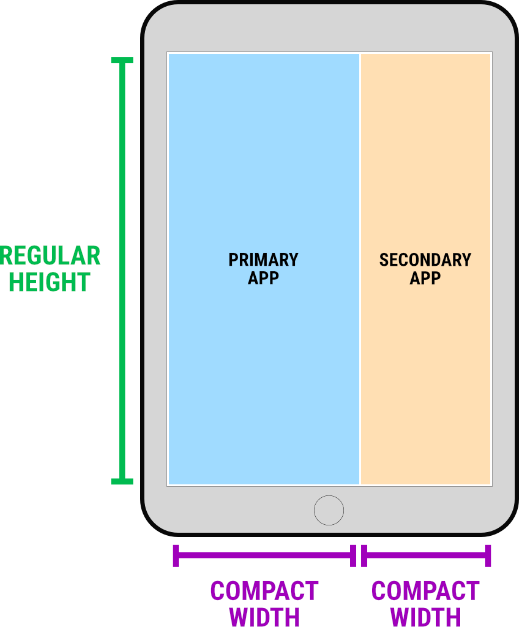
In portrait, there’s only one multitasking mode where the primary app has a slightly larger area available, still they both have a compact width:
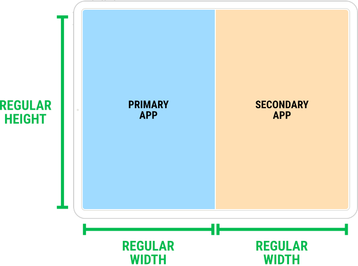
Lastly, the horizontal size classes differ in the split view for the largest 12.9" models in landscape orientation. In this case both apps have a regular width:
We’ll see how to obtain the size class information from the system once we start building our example layouts.
Layout guides (safe area, layout margins)
When creating layouts for iOS devices we need to take extra care to avoid positioning UI elements over system UI, such as the status bar, or screen cut–outs (e.g. the camera housing area, rounded screen corners) featured by some iPhone and iPad models. Similarly, when creating nested views, we often want to create margins inside a view for better visual perception and understanding. Thankfully iOS provides the means for building layouts that accomplish these tasks with ease.
With the introduction of UILayoutGuide in iOS 9, we are able to create invisible rectangular areas that can interact with Auto Layout. Previously we had to create dummy hidden views to aid in achieving certain layouts; using layout guides is safer and more efficient. While we can create our own layout guides, the system provides two major ones for us:
- Safe area layout guide
- Layout margins guide
Safe area
The safe area defines a rectangle that can be safely used to display our app’s content. By creating our layout constraints against the safe area layout guide, we can be sure our UI won’t conflict with any system UI or be clipped due to a screen cut–out. Each view has its own safe area as determined by the system. The example below shows a single view controller with a blue background and a single child view colored in red. The red view has four constraints to all edges of the safe area layout guide of the view controller’s view:
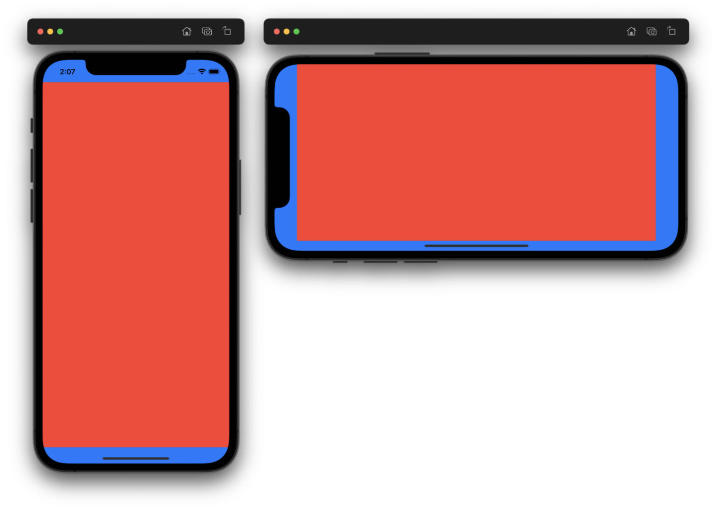
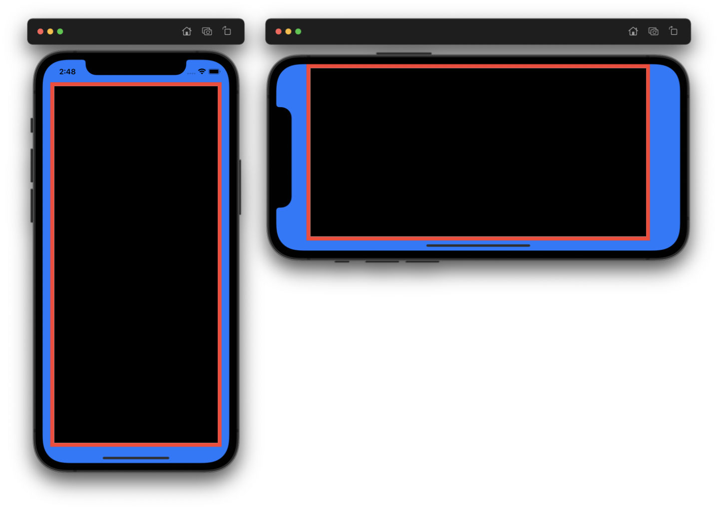
In portrait, the red view doesn’t reach all the way to the top and bottom edges of the screen because this is where the bounds of the safe area are defined. In landscape, the safe area is even smaller to give enough space for the home indicator. If we were to ignore the safe area layout guide and constraint the view to the root view’s edges instead, it would have been clipped.
Layout margins
The second layout guide provided by each view is the layout margins guide. When adding constraints to the superview’s layout margins guide, the constrained view will be inset by certain margin as specified by the superview. Let’s see an example — we have a view controller with a blue background, a red subview and a black view that is a subview of the red view:
Once again, the red view is constrained to all edges of the layout margins guide of the blue view (view controller’s view). The black view on the other hand is constrained to all edges of the red view’s layout margins guide. No constants are used to inset the constraints.
The default margin is 8 points for each edge, the only exception is the view controller’s root view (in this case the blue one) where the margins are 16 points (compact size class) and 20 points (regular size class) for the horizontal edges with no margin for the vertical ones. The margins can also be customized by updating the layoutMargins property:
view.layoutMargins = UIEdgeInsets(top: 0, left: 24, bottom: 0, right: 24)Note that by default the view’s layout margins are updated automatically to reflect the safe area, so the red view in the example above does not reach all the way to the top and bottom edges of the screen even though there are no margins defined. When we disable this behavior on the blue view, the red view will expand beyond the safe area. At the same time the black view will still reflect the safe area, since this behavior is still enabled for the red view:
blueView.insetsLayoutMarginsFromSafeArea = false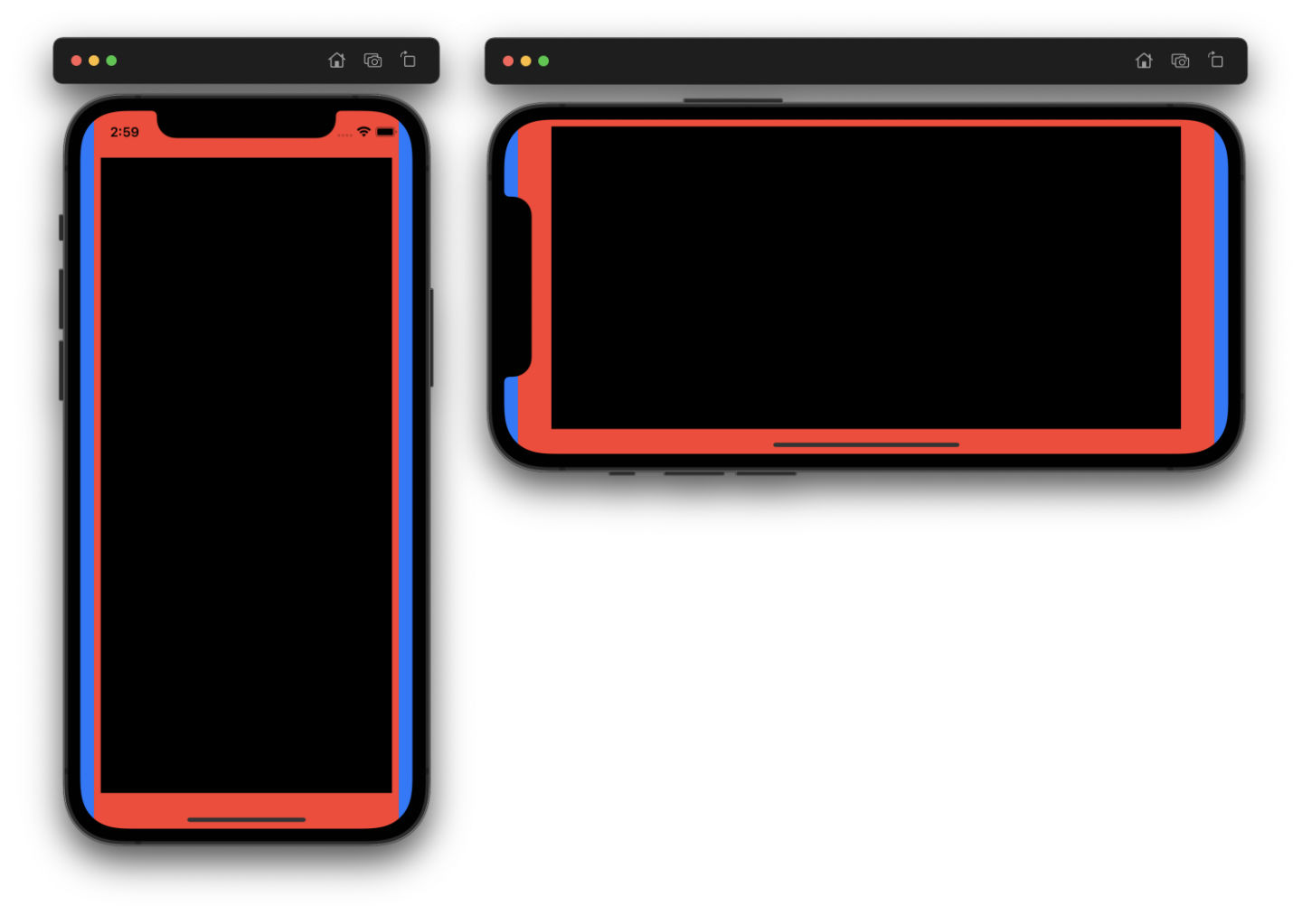
We’ll see actual code on how to access both safe area and layout margins guides when we get to building our examples.
Autoresizing mask
The last topic we’ll cover here is the autoresizing mask. By default, an autoresizing system is active for each view, which automatically resizes a subview when the size of its superview changes. It is a rather basic way to handle view size changes and to have our layout adapt somewhat without using constraints. However, it doesn’t support relationships between other subviews, only a direct parent–child relationship, thus it has a limited usability when building complex layouts.
I’ll not be doing a deep dive into the autoresizing system, however it’s important to mention that it actually creates layout constraints under the hood. Due to this, it’s very easy to run into conflicts with the autoresizing constraints when creating our own constraints, unless the autoresizing is disabled manually for each view. Failing to do this is possibly the most common reason for the "Unable to simultaneously satisfy constraints" error to show up in the console.
Luckily it’s very easy to let the system know that we do not want to have the autoresizing constraints created by setting the translatesAutoresizingMaskIntoConstraints property to false:
let view = UIView()
view.translatesAutoresizingMaskIntoConstraints = false
Conclusion
All right, enough theory, it’s time to get our hands dirty! Doing some practical examples is often the best way to acquire a new skill and coding Auto Layout is no different. In the next post we’ll finally jump into Xcode and start coding!
References
Table 1: Default priorities for content hugging and compression resistance.
| View | Content Hugging (H, V) | Compression resistance (H, V) |
|---|---|---|
UIActivityIndicatorView |
750, 750 | 750, 750 |
UIButton |
250, 250 | 750, 750 |
UIDatePicker |
750, 750 | 750, 750 |
UIImageView |
250, 250 | 750, 750 |
UILabel |
250, 250 | 750, 750 |
UIPageControl |
750, 750 | 750, 750 |
UIPickerView |
750, 750 | 750, 750 |
UIProgressView |
250, 750 | 750, 750 |
UIScrollView |
250, 250 | 750, 750 |
UISearchBar |
250, 750 | 750, 750 |
UISegmentedControl |
250, 750 | 750, 750 |
UISlider |
250, 750 | 750, 750 |
UIStepper |
750, 750 | 750, 750 |
UISwitch |
750, 750 | 750, 750 |
UITabBar |
250, 750 | 750, 750 |
UITextField |
250, 250 | 750, 750 |
UITextView |
250, 250 | 750, 750 |
UIToolbar |
250, 750 | 750, 750 |
UIView |
250, 250 | 750, 750 |
Table of contents
- Intro
- Basics, Part One
- Basics, Part Two (reading now)
- Xcode Setup
- Sign Up Screen
- Stack Views
- Custom UIAlert
- Players Profile
- Twitter Timeline
- Twitter Profile
- Music Album