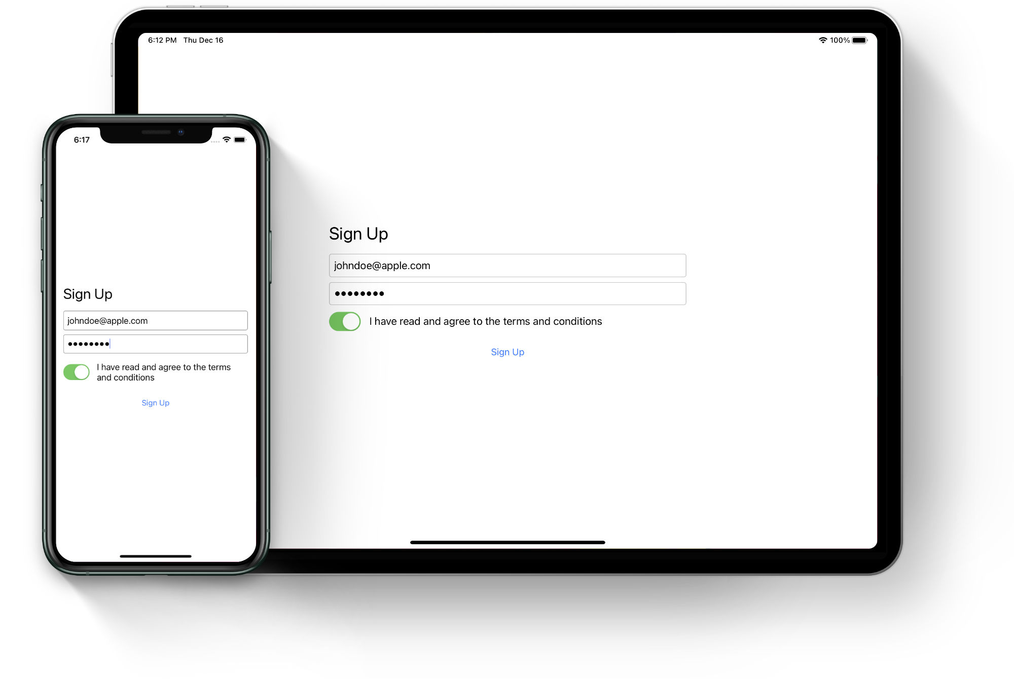
For our first layout we are going to build a simple sign up screen. Nothing fancy, but we have to start somewhere!
Overview
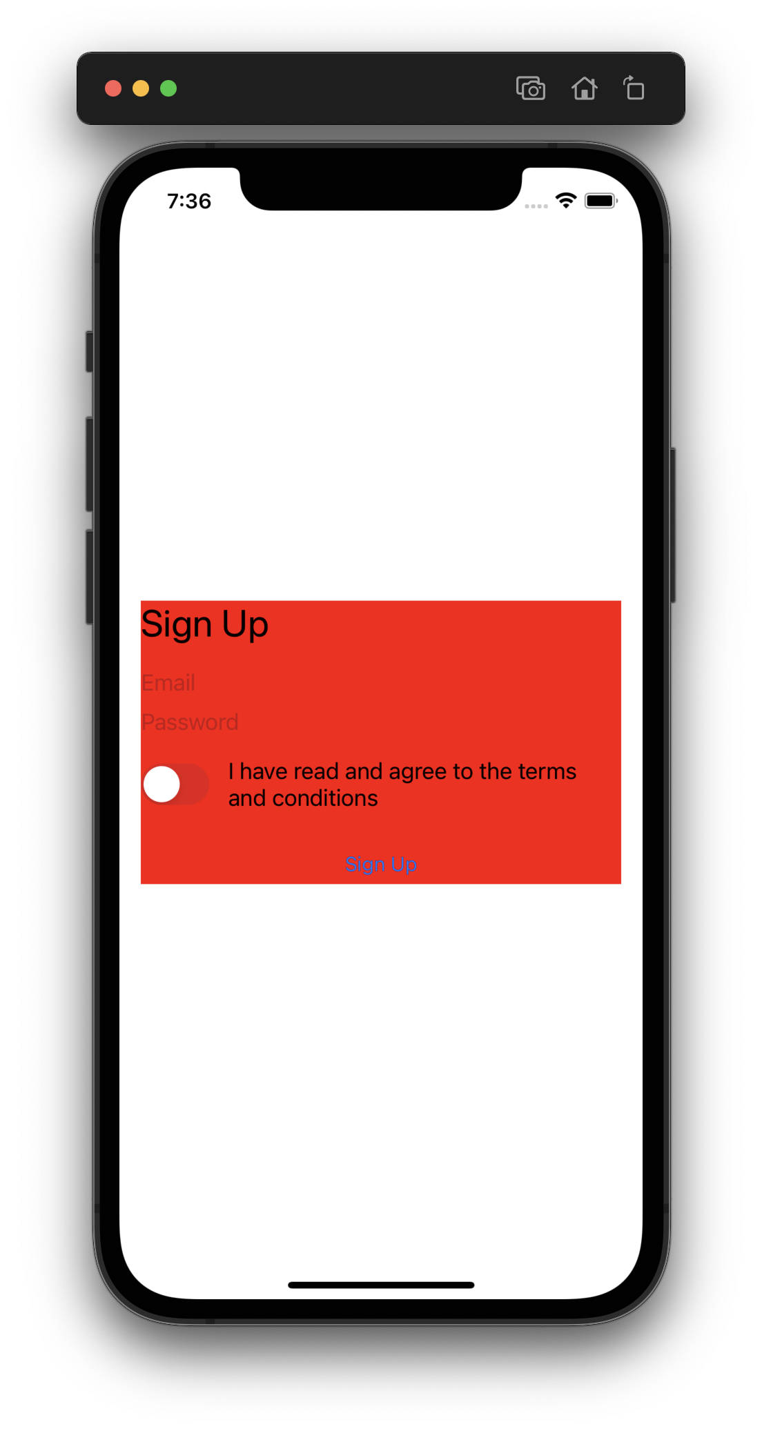
Let’s analyze the screenshot to get a better idea about the layout. Almost all the views are stacked vertically, only the UISwitch and "terms and conditions" label are arranged horizontally. In compact environment the width is constrained all the way to the margins while for the regular size class the views are limited to half the width of the superview. As a whole the views are centered both horizontally and vertically. Looks pretty simple, let’s get started!
Create a new iOS project in Xcode or open the starting project for this example, it is available on GitHub.
Creating container view
As mentioned the views are centered both horizontally and vertically as a whole, which hints at using a container view. This view will contain all the other views making it easy to constrain the width and align the centers. For this purpose we’ll create a new file called SignUpView.swift and create a subclass of UIView:
import UIKit

class SignUpView: UIView {

    init() { // (1)
        super.init(frame: .zero)

        self.setupView() // (2)
    }

    required init?(coder: NSCoder) { // (3)
       fatalError("init(coder:) has not been implemented")
    }

    private func setupView() {
    }

}
- Our subclass implements a custom initializer with no parameters.
- This initializer calls a private
setupView()method where we'll create our subviews and layout constraints. - The
init?(coder: NSCoder)is only used with storyboards, as such it is a common practice to leave it unimplemented.
Let’s add our new view to the root view controller. Edit the view controller file to include the following changes:
class RootViewController: UIViewController {

    private let signUpView = SignUpView() // (1)

    override func viewDidLoad() {
        super.viewDidLoad()

        self.view.addSubview(self.signUpView) // (2)
    }

}
- Add a member property to have a reference to our view.
- Add the view to the hierarchy.
Before we add any constraints let’s take a look how to obtain the information about the current size class.
Adapting to size class
We want the layout to look differently depending on the environment (compact or regular) so we’ll need to make use of size classes. The current size class is provided by the UITraitCollection object that can be accessed via the traitCollection property on every view and view controller.
We’ll create a new method in the view controller that will handle the activation of the layout constraints for the container view:
private func setupView() {
    if self.traitCollection.horizontalSizeClass == .regular {
        // add constraints for the regular width
    } else {
        // add constraints for the compact width
    }
}
We check the horizontalSizeClass property of the trait collection object to determine the size class for the horizontal dimension. This makes it possible to create different constraints for the two environments.
Next we need to make sure we actually call this method at some point. When do we need to do that? As mentioned above, the traits are only fully initialized and guaranteed to be correct after the view has been added to the view hierarchy. Thus making the call in the viewDidLoad() method will not do the trick. Luckily every view and view controller implements the UITraitEnvironment protocol and implements the following method:
func traitCollectionDidChange(_ previousTraitCollection: UITraitCollection?)The system calls this method when the iOS interface environment changes. By overriding the implementation in our views and view controllers, we can adapt the layout for the new traits. Let’s do that in our view controller:
override func traitCollectionDidChange(_ previousTraitCollection: UITraitCollection?) {
    super.traitCollectionDidChange(previousTraitCollection) // (1)

    if previousTraitCollection?.horizontalSizeClass != self.traitCollection.horizontalSizeClass { // (2)
        self.setupView(for: self.traitCollection)
    }
}- We must not forget to call super.
- Since the method receives the previous traits as a parameter, we can check if the trait we are interested in (in this case the horizontal size class) changed at all to only perform the necessary layout logic when needed. Note the parameter may be
nilsince there may not be any previous traits, for example when the method is called the very first time.
With this implementation we cover the cases when the traits are provided by the system for the first time as well as when the traits change at any time later on (such as when the device orientation changes). However a significant change has been introduced in iOS 13 — the initial traits are set on each view when it is instantiated, before it is added to the view hierarchy. This still does not guarantee the traits will be correct though. The system attempts to set the likely traits based on the view context and if it guesses correctly, the traitCollectionDidChange method will not be called during the first layout of the view. Due to this behavior, we should add the call to setupView to the end of the viewDidLoad method:
override func viewDidLoad() {
    super.viewDidLoad()

    ...

    self.setupView()
}
Adding constraints
Let’s summarize the layout requirements for the container view:
- Compact environment — horizontally the view is stretched all the way to the superview margins and centered vertically.
- Regular environment — horizontally the view is limited to half the width of the superview and centered both horizontally and vertically.
The height of the view is determined by the height of its subviews and not set using a constraint here (we’ll address the height later once we layout the subviews). In addition, we may be required to change the constraints at runtime (for example after rotating the device and changing the horizontal size class), thus we’ll need to store the constraints we create to be able to deactivate them later.
There are multiple ways to create a constraint, some preferred over the others. We’re not going to look at all of them here, instead we’ll use arguably the most common and convenient method — the layout anchors. Each view provides an anchor for every layout attribute we saw in the earlier post. We can use the anchors to build our constraints with ease, for example:
               (1)                                                    (2)                   (3)
signUpView.widthAnchor.constraint(equalTo: view.layoutMarginsGuide.widthAnchor, multiplier: 0.5)
We are using the container’s view widthAnchor (1) and making it equal to the width of the view controller’s layout margins guide (2) (not the view controller’s view itself). By setting the multiplier (3) to 0.5 we effectivelly limit the container’s width to half. Similarly we can create the remaining constraints to center the container view horizontally (1) and vertically (2).
(1) signUpView.centerXAnchor.constraint(equalTo: view.layoutMarginsGuide.centerXAnchor)
(2) signUpView.centerYAnchor.constraint(equalTo: view.layoutMarginsGuide.centerYAnchor)
Activating and deactivating constraints
Note that while we have created the constraints, they are still unknown to Auto Layout at this point. In order to make Auto Layout consider our constraints, we need to activate them. Again there are multiple ways to do that, we’ll look at two of them:
- Set the constraint's
isActiveproperty totrue:signUpView.centerYAnchor.constraint(equalTo: view.centerYAnchor).isActive = true - When creating multiple constraints, it's preferable to activate them all at once with an array of constraints:
NSLayoutConstraint.activate([
    signUpView.widthAnchor.constraint(equalTo: view.layoutMarginsGuide.widthAnchor, multiplier: 0.5),
    signUpView.centerXAnchor.constraint(equalTo: view.layoutMarginsGuide.centerXAnchor),
    signUpView.centerYAnchor.constraint(equalTo: view.layoutMarginsGuide.centerYAnchor)
])
To deactivate a constraint, we should store it in a variable in order to be able to set the isActive property to false later on:
let constraint: NSLayoutConstraint = signUpView.centerXAnchor.constraint(equalTo: view.centerXAnchor)

...

constraint.isActive = false
Once again multiple constraints can be deactivated with a single call using an array of constraints:
let constraints: [NSLayoutConstraint] = [
  signUpView.centerXAnchor.constraint(equalTo: view.centerXAnchor),
  signUpView.centerYAnchor.constraint(equalTo: view.centerYAnchor)
]

...

NSLayoutConstraint.deactivate(constraints)
Knowing this, we can now finalize the constraints for the container view. Jump back to the root view controller and make the following edits:
- Add a new member property to hold our active constraints:
private var activeConstraints: [NSLayoutConstraint] = [] - Assign the constraints for the regular size class (we defined them above) to the
activeConstraintsarray within theifbranch inside thesetupViewmethod:private func setupView(for traitCollection: UITraitCollection) { if traitCollection.horizontalSizeClass == .regular { self.activeConstraints = [ self.signUpView.widthAnchor.constraint(equalTo: self.view.layoutMarginsGuide.widthAnchor, multiplier: 0.5), self.signUpView.centerXAnchor.constraint(equalTo: self.view.layoutMarginsGuide.centerXAnchor), self.signUpView.centerYAnchor.constraint(equalTo: self.view.layoutMarginsGuide.centerYAnchor) ] } else { } } - Create constraints for the compact size class (the
elsebranch) and assign them to theactiveConstraintsarray. Once again we'll need just three constraints — match theleading (1),trailing (2)andcenterY (3)anchors of the container view with the layout margins guide of the view controller:private func setupView(for traitCollection: UITraitCollection) { if traitCollection.horizontalSizeClass == .regular { ... } else { self.activeConstraints = [ self.signUpView.leadingAnchor.constraint(equalTo: self.view.layoutMarginsGuide.leadingAnchor), // (1) self.signUpView.trailingAnchor.constraint(equalTo: self.view.layoutMarginsGuide.trailingAnchor), // (2) self.signUpView.centerYAnchor.constraint(equalTo: self.view.layoutMarginsGuide.centerYAnchor) // (3) ] } } - Now that we have the constraints, we need to remember to activate them. Simply add the
activatecall at the end of thesetupViewmethod:NSLayoutConstraint.activate(self.activeConstraints) - Finally, we also need to make sure any active constraints are deactivated before we create any new ones. We can do this at the beginning of the
setupViewmethod:NSLayoutConstraint.deactivate(self.activeConstraints)
That’s all the setup we need to do in our view controller. We also must not forget to disable the autoresizing mask for the sign up view, which we can do in the setupView() method inside SignUpView.swift:
private func setupView() {
    self.translatesAutoresizingMaskIntoConstraints = false
}
Sadly we won’t see anything on the screen just yet since we haven’t added anything to our container view!
Container subviews
Let’s jump back to the SignUpView.swift file and starting creating our views in the setupView method.
Title label
The first view is the title label. We initialize the label, set initial properties, add it to the view hierarchy and finally set the constraints:
private func setupView() {
    self.translatesAutoresizingMaskIntoConstraints = false

    let titleLabel = UILabel()
    titleLabel.translatesAutoresizingMaskIntoConstraints = false // (1)
    titleLabel.font = UIFont.preferredFont(forTextStyle: .title1)
    titleLabel.text = "Sign Up"
    self.addSubview(titleLabel)

    // (2)
    NSLayoutConstraint.activate([
        titleLabel.leadingAnchor.constraint(equalTo: self.leadingAnchor),
        titleLabel.trailingAnchor.constraint(equalTo: self.trailingAnchor),
        titleLabel.topAnchor.constraint(equalTo: self.topAnchor)
    ])
}- As always we must not forget to disable the autoresizing mask.
- We create and activate the constraints right away. The constraints are as simple as they can get — we pin the label's leading and trailing anchors to the superview to make the label take on the width of its parent. The top anchor constraint fixes the label's position to the top of the superview.
Email and password fields
Next we’ll add the text fields to be able to input the email and password. First we add the following code to create the email text field:
let emailField = UITextField()
emailField.translatesAutoresizingMaskIntoConstraints = false
emailField.placeholder = "Email"
self.addSubview(emailField)

NSLayoutConstraint.activate([
    emailField.leadingAnchor.constraint(equalTo: self.leadingAnchor), // (1)
    emailField.trailingAnchor.constraint(equalTo: self.trailingAnchor), // (1)
    emailField.topAnchor.constraint(equalTo: titleLabel.bottomAnchor, constant: 16) // (2)
])
Once again we initialize the view first, set some properties and activate the constraints after it has been added to the view hierarchy:
- Same as the title label, this text field is pinned to the leading and trailing anchors of the superview, making it occupy the full width.
- For the top anchor we are doing something different — it is pinned to the bottom anchor of the title label with a constant of
16. This will make the text field appear below the title label with a gap of16points.
The password field is built in a very similar fashion:
let passwordField = UITextField()
passwordField.translatesAutoresizingMaskIntoConstraints = false
passwordField.placeholder = "Password"
passwordField.isSecureTextEntry = true
self.addSubview(passwordField)

NSLayoutConstraint.activate([
    passwordField.leadingAnchor.constraint(equalTo: self.leadingAnchor), // (1)
    passwordField.trailingAnchor.constraint(equalTo: self.trailingAnchor), // (1)
    passwordField.topAnchor.constraint(equalTo: emailField.bottomAnchor, constant: 8) // (2)
])- The horizontal constraints are exactly the same as for the previous views.
- The vertical constraint uses the same principle as in the case of the email text field. This time we are using the bottom anchor of the email field to make the password field appear below. The constant is a bit smaller compared to the title–email constraint to make the two text fields appear a little closer to each other.
Terms and conditions
We continue on to the toggle and "terms and conditions" label. This one is a little more complicated since we need to position the views vertically after the password field and also arrange them horizontally between themselves. Since the constraints for both the toggle and the label will reference each other, we’ll create both views and them to the view hierarchy first before adding any constraints:
let toggle = UISwitch()
toggle.translatesAutoresizingMaskIntoConstraints = false
self.addSubview(toggle)

let termsLabel = UILabel()
termsLabel.translatesAutoresizingMaskIntoConstraints = false
termsLabel.text = "I have read and agree to the terms and conditions"
self.addSubview(termsLabel)
We can now start adding constraints that reference any of these two views without running into errors. First the UISwitch:
NSLayoutConstraint.activate([
    toggle.leadingAnchor.constraint(equalTo: self.leadingAnchor), // (1)
    toggle.centerYAnchor.constraint(equalTo: termsLabel.centerYAnchor) // (2)
])
We are adding only two constraints in this case — for the horizontal and vertical position. The view has an intrinsic size (both the width and height) so we need not to worry about that:
- We pin the leading anchor to the superview, making in appear on the left (or right for RTL locales) of the superview.
- For the vertical position we simply align the vertical centers with the terms label (which we'll add the constraints for next).
We now want the termsLabel to be positioned below the password field and appear next to the toggle, stretching all the way to the trailing edge of the superview:
termsLabel.setContentCompressionResistancePriority(.defaultLow, for: .horizontal) // (1)

NSLayoutConstraint.activate([
    termsLabel.leadingAnchor.constraint(equalTo: toggle.trailingAnchor, constant: 16), // (2)
    termsLabel.trailingAnchor.constraint(equalTo: self.trailingAnchor), // (3)
    termsLabel.topAnchor.constraint(equalTo: passwordField.bottomAnchor, constant: 16) // (4)
])- Since we want the label to be stretched to fill the available layout space, the content hugging property must be lower than that of the toggle. We do not have to set this priority explicitly because
UISwitchhas a higher content hugging priority by default. We should however lower the compression resistance priority on the label (both views have the same priority by default) to avoid any unwanted compression on the toggle view. - The leading anchor of the label is pinned to the trailing anchor of the toggle with an offset of
16points, making the label appear next to it with a small gap. - The label's trailing anchor is pinned to the trailing anchor of the superview, making use of all the remaining space horizontally.
- The top anchor is pinned to the bottom anchor of the password field, putting it below the text fields.
If we build and run the project now we’ll see that the layout is fine for the most part. However when running on a smaller phone the termsLabel text will be trimmed:
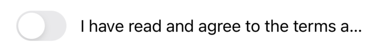
By default, each label is limited to a single line of text, but we can easily adjust that using the numberOfLines property:
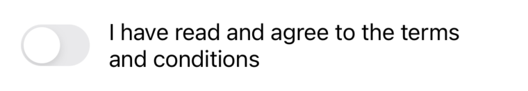
termsLabel.numberOfLines = 0Now the label is allowed to span multiple lines when needed:
Sign up button
The final view in our layout is the button. It is centered horizontally and placed below the termsLabel. Since UIButton has an intrinsic content size, it sounds like we only need to fix its position with two constraints:
let button = UIButton(type: .system)
button.translatesAutoresizingMaskIntoConstraints = false
button.setTitle("Sign Up", for: .normal)
self.addSubview(button)

NSLayoutConstraint.activate([
    button.centerXAnchor.constraint(equalTo: self.centerXAnchor), // (1)
    button.topAnchor.constraint(equalTo: termsLabel.bottomAnchor, constant: 24) // (2)
])- The button's horizontal center anchor is pinned to the horizontal center of the superview, making it appear exactly in the middle.
- Finally the button's top anchor is pinned to the bottom anchor of the terms label with a slightly larger gap.
We can now build and run our project to see our beautiful layout!
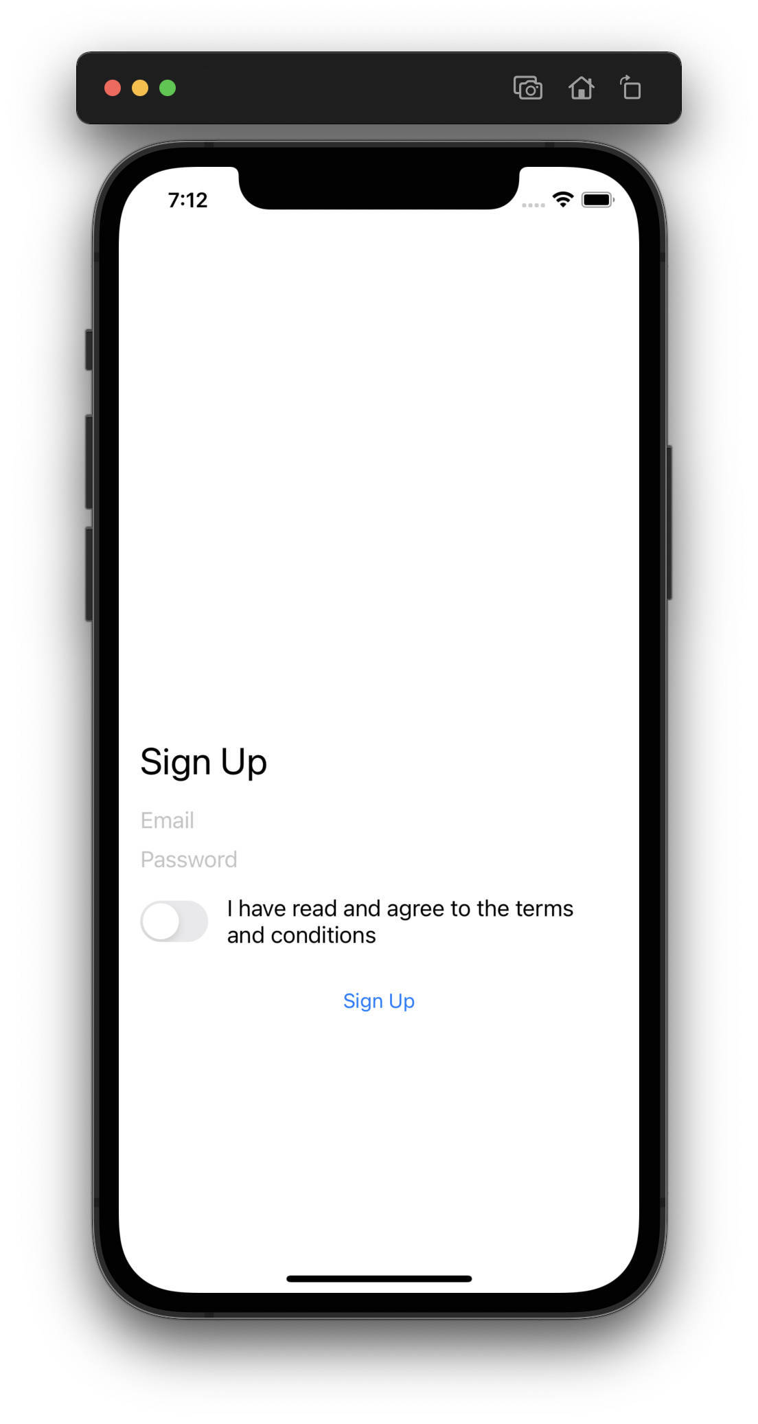
Hang on a second, it looks way off. Clearly the views are not centered vertically on the screen. Furthermore if we try to interact with any of the views they completely ignore us — unacceptable!
Fixing the layout
To understand the issue we need to realize that our SignUpView has no intrinsic content size, thus its size must be set by constraints. Did we do that for both the width and height? We didn’t! We’ve only set constraints for the width inside our view controller, but we are not mentioning the height anywhere. At this point the height is zero and as such it’s also not receiving any touches (because all touches are inherently out of bounds). We can see the view has no height by setting its background color in the setupView method to something obvious, such as red:
self.backgroundColor = .redWe run the project again to confirm that indeed we don’t see the red background. Since the height of the container view should match the total height of all the views it contains, we need to add another constraint for the sign up button that will pin its bottom edge to the bottom edge of the container. This will make the container grow to the correct height:
NSLayoutConstraint.activate([
    button.centerXAnchor.constraint(equalTo: self.centerXAnchor),
    button.topAnchor.constraint(equalTo: termsLabel.bottomAnchor, constant: 24),

    // New constraint for the button
    button.bottomAnchor.constraint(equalTo: self.bottomAnchor)
])
When we run the project again we can see that the view finally has a height and is centered correctly:
Final touches
Notice that the sign up button is not limited in its width whatsoever — it is centered horizontally and is allowed to expand as much as it wants to. If we were to set the button’s title to something very very long, it would grow beyond the screen’s bounds:
button.setTitle("What would happen if the title of this button were ridiculously long?", for: .normal)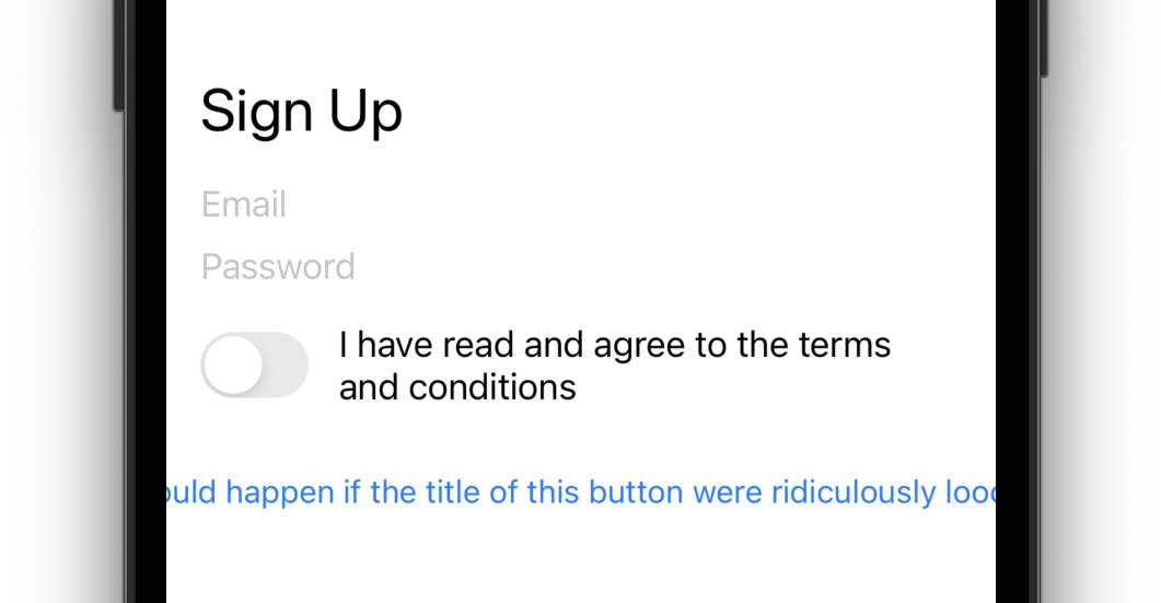
Granted the example above is fairly exaggerated, but still is there something we could do to make the button limit its width without making it larger than it necessarily needs to be? Of course we could (and should)! By constraining the leading and trailing edges, we’ll limit the width of the button. However we’ll now use a different constraint relation (instead of equalTo) to make sure we are not stretching the button unnecessarily:
NSLayoutConstraint.activate([
    button.centerXAnchor.constraint(equalTo: self.centerXAnchor),
    button.topAnchor.constraint(equalTo: termsLabel.bottomAnchor, constant: 24),
    button.bottomAnchor.constraint(equalTo: self.bottomAnchor),

    // New constraints for the button
    button.leadingAnchor.constraint(greaterThanOrEqualTo: self.leadingAnchor), // (1)
    button.trailingAnchor.constraint(lessThanOrEqualTo: self.trailingAnchor) // (2)
])- We used the greater than or equal to relation for the leading anchor to allow the button's leading edge be away from the parent's leading edge if it needs to be. Since we are also centering the button horizontally it is exactly what we want. At the same time we're ensuring the button will not go out of bounds at the parent's leading edge.
- Similarly for the trailing anchor — here we are using the less than or equal to relation, allowing the button's trailing edge to be less than that of the parent, but never greater. These two constraints now effectively limit the button's width.
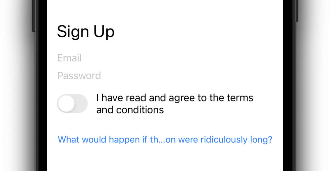
Running the project again with these new constraints results in the button’s title being trimmed in the middle, since the button’s width is now limited:
To demonstrate the difference between these and the equal to relation, let’s revert the title back and set the button’s background color to red so that we can clearly observe the button’s bounds:
button.backgroundColor = .red
button.setTitle("Sign Up", for: .normal)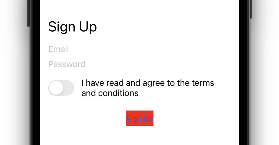
As we can see, the width of the button matches the intrinsic size and is not made larger than it needs to be.
However if we change the relation of the leading and trailing constraints to equal to, the button ends up being stretched to satisfy the constraints:
button.leadingAnchor.constraint(equalTo: self.leadingAnchor),
button.trailingAnchor.constraint(equalTo: self.trailingAnchor)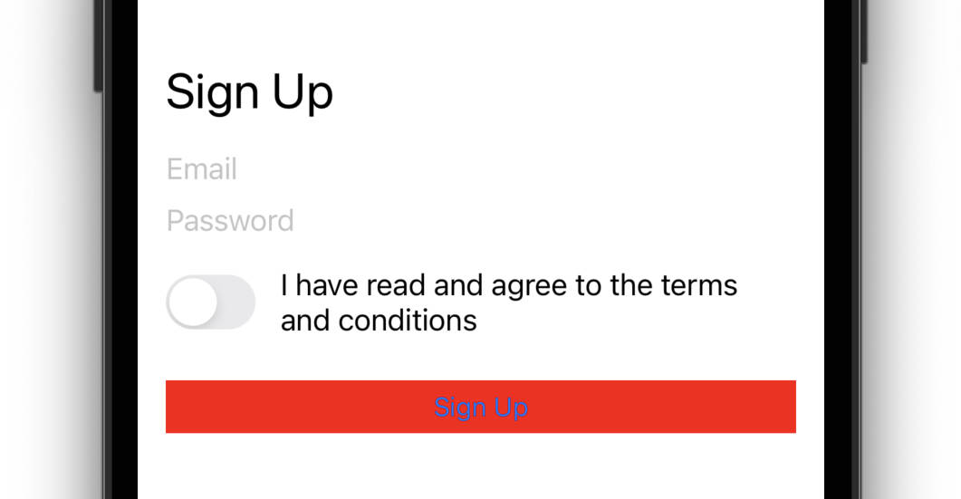
Of course, depending on the design requirements, we may want to use one or the other.
Source code
Complete source code for this and all the other examples is available on GitHub.
Where to next
- Intro
- Basics, Part One
- Basics, Part Two
- Xcode Setup
- Sign Up Screen (reading now)
- Stack Views
- Custom UIAlert
- Players Profile
- Twitter Timeline
- Twitter Profile
- Music Album