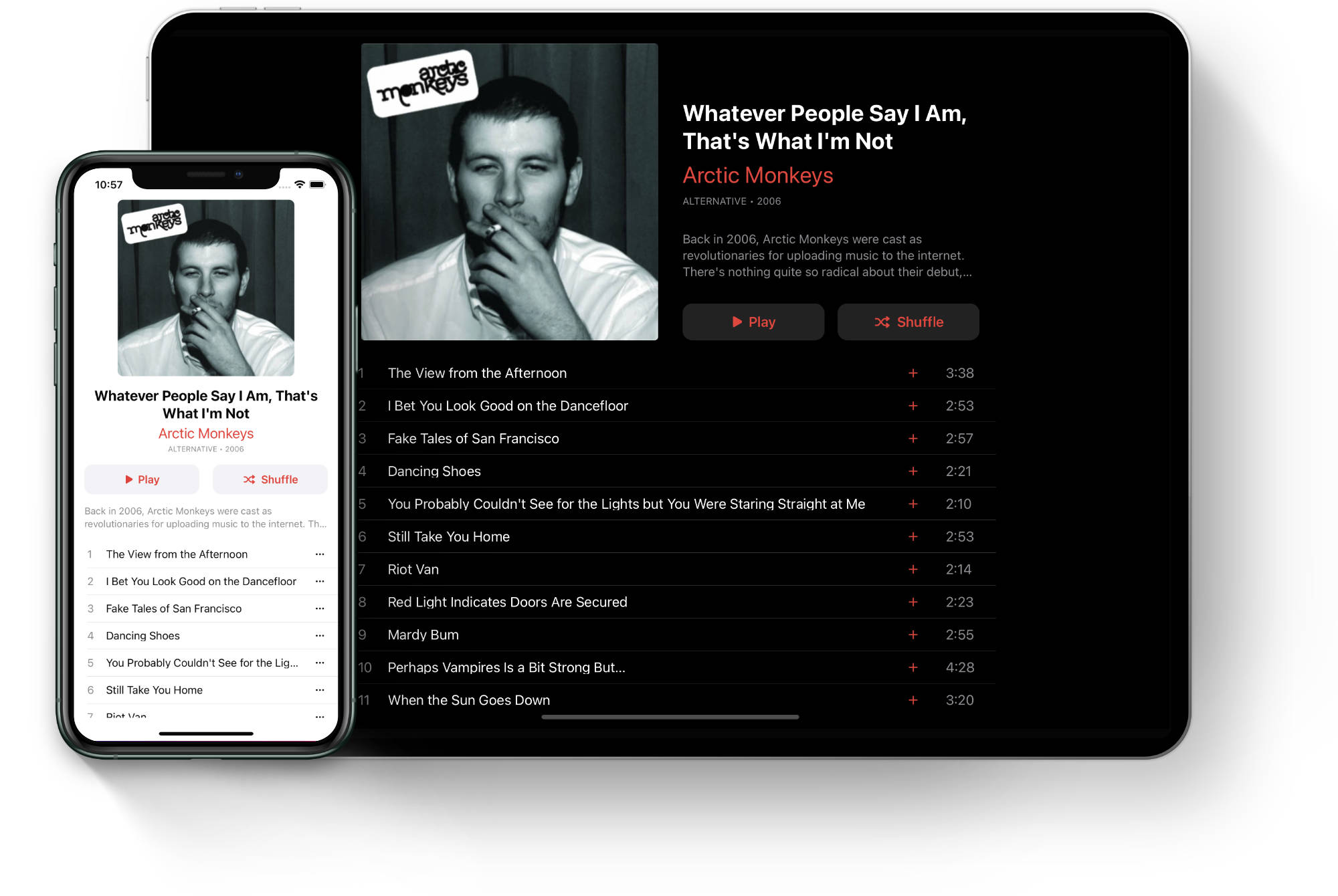
In this example we are going to build a layout for a music album, similar to what can be seen in the Apple Music app. We’ll learn how to create UITableView with a self–sizing header.
Overview
The header contains the album’s cover, name and artist’s information. It also includes play and shuffle buttons. The views are arranged vertically for the compact size class, while for regular size class the header layout combines horizontal and vertical arrangement. The individual cells contain the track’s order and name. Compact size class also contains an ellipsis button to display a pop up menu. Regular size class includes another label to display the length of the track and a plus button for adding a song to the music library.
Create a new iOS project in Xcode or open the starting project for this example, it is available on GitHub.
View model
As always let’s define the models first inside Models.swift. We’ll start with the header model and nest it inside the Album enum:
import UIKit

enum Album {
    enum Header {
        struct ViewModel {
            let coverImage: UIImage?
            let title: String
            let artistName: String
            let genre: String
            let description: String
        }
    }
}
Next is the view model for the album’s track:
enum Album {
    ...

    enum Track {
        struct ViewModel: Hashable {
            let id: UUID
            let order: String
            let title: String
            let length: String
        }
    }
}
And finally the view model for the album itself:
enum Album {
    ...

    struct ViewModel {
        let header: Album.Header.ViewModel
        let tracks: [Album.Track.ViewModel]
    }
}
Within the Models.swift file we’ll also create a sample album to populate our table view:
enum SampleModel {
static let album: Album.ViewModel = Album.ViewModel(
header: Album.Header.ViewModel(
coverImage: UIImage(named: "album"),
title: "Whatever People Say I Am, That's What I'm Not",
artistName: "Arctic Monkeys",
genre: "ALTERNATIVE • 2006",
description: "Back in 2006, Arctic Monkeys were cast as revolutionaries for uploading music to the internet. There's nothing quite so radical about their debut, which fuses a punk snarl with the sharp tunes and agitated rhythms of New Wave."),
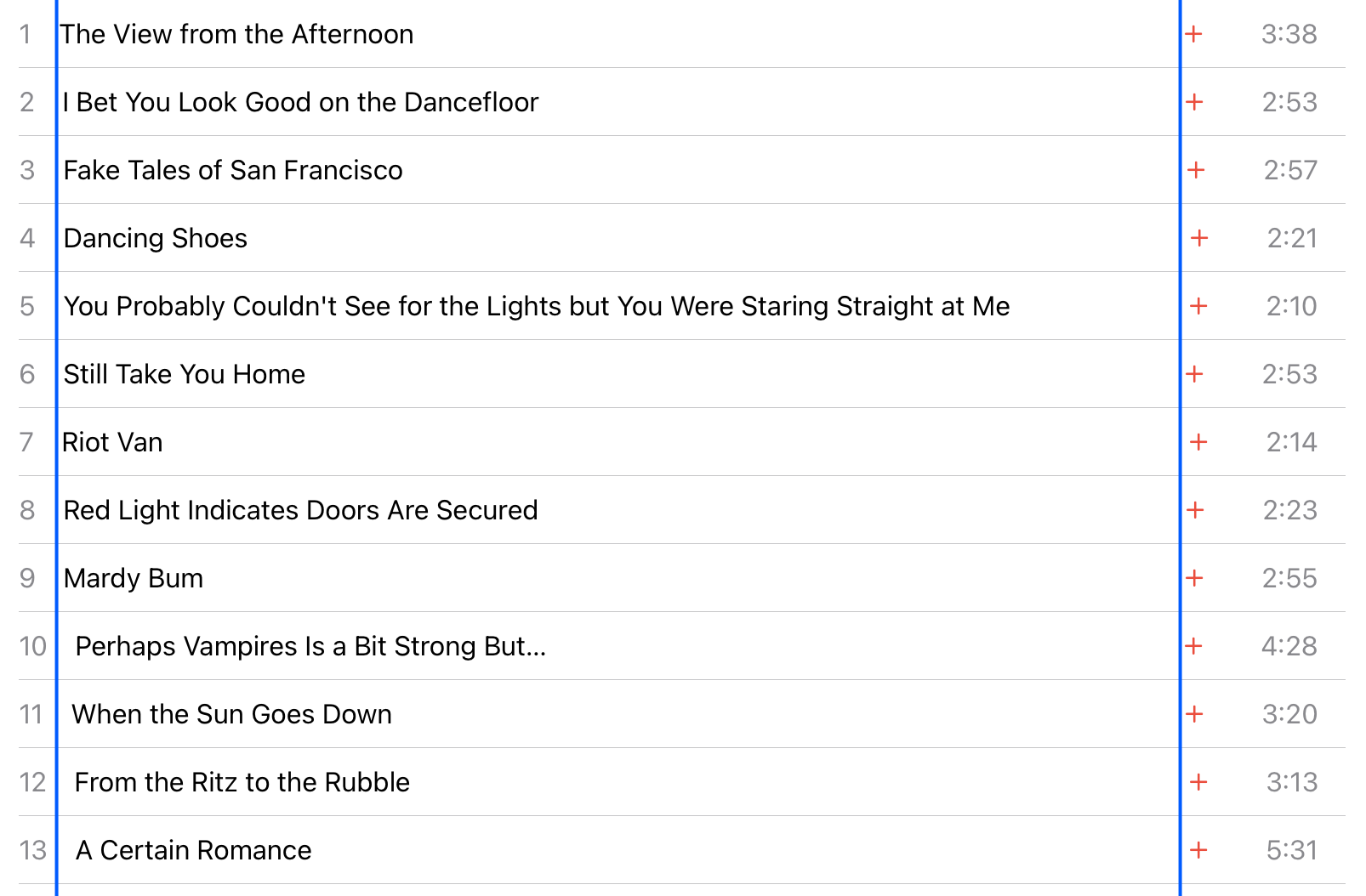
tracks: [
Album.Track.ViewModel(id: UUID(), order: "1", title: "The View from the Afternoon", length: "3:38"),
Album.Track.ViewModel(id: UUID(), order: "2", title: "I Bet You Look Good on the Dancefloor", length: "2:53"),
Album.Track.ViewModel(id: UUID(), order: "3", title: "Fake Tales of San Francisco", length: "2:57"),
Album.Track.ViewModel(id: UUID(), order: "4", title: "Dancing Shoes", length: "2:21"),
Album.Track.ViewModel(id: UUID(), order: "5", title: "You Probably Couldn't See for the Lights but You Were Staring Straight at Me", length: "2:10"),
Album.Track.ViewModel(id: UUID(), order: "6", title: "Still Take You Home", length: "2:53"),
Album.Track.ViewModel(id: UUID(), order: "7", title: "Riot Van", length: "2:14"),
Album.Track.ViewModel(id: UUID(), order: "8", title: "Red Light Indicates Doors Are Secured", length: "2:23"),
Album.Track.ViewModel(id: UUID(), order: "9", title: "Mardy Bum", length: "2:55"),
Album.Track.ViewModel(id: UUID(), order: "10", title: "Perhaps Vampires Is a Bit Strong But…", length: "4:28"),
Album.Track.ViewModel(id: UUID(), order: "11", title: "When the Sun Goes Down", length: "3:20"),
Album.Track.ViewModel(id: UUID(), order: "12", title: "From the Ritz to the Rubble", length: "3:13"),
Album.Track.ViewModel(id: UUID(), order: "13", title: "A Certain Romance", length: "5:31")
])
}Default tint color
By default the system uses blue color as a tint for standard iOS controls. To match the look of the Apple Music app a little more closely, let’s change the default tint color to red on the window object in AppDelegate.swift:
window?.tintColor = .systemRedNSLayoutConstraint extension
As part of the setup, let’s also create an extension for NSLayoutConstraint that we’ll use later when creating optional constraints. In a new file Extensions.swift paste the following code:
import UIKit

extension NSLayoutConstraint {

    func withPriority(_ priority: UILayoutPriority) -> NSLayoutConstraint {
        self.priority = priority
        return self
    }

}
Creating table view
Next we want to setup the table view in our root view controller. In order to do that we first need to create a subclass for our cell view:
class AlbumTrackTableViewCell: UITableViewCell {

    override init(style: UITableViewCell.CellStyle, reuseIdentifier: String?) {
        super.init(style: style, reuseIdentifier: reuseIdentifier)

        self.setupView()
    }

    required init?(coder: NSCoder) {
        fatalError("init(coder:) has not been implemented")
    }

    private func setupView() {

    }

}
We’ll keep the class empty for now and return to it later on. Now we go back to our view controller file and initialize the table view along with the data source:
class RootViewController: UIViewController {

    private let cellId: String = "trackCell"
    private let tableView = UITableView(frame: .zero, style: .plain)
    private lazy var dataSource = UITableViewDiffableDataSource<Int, Album.Track.ViewModel>(tableView: self.tableView) { tableView, indexPath, track in
        let cell = tableView.dequeueReusableCell(withIdentifier: self.cellId, for: indexPath) as! AlbumTrackTableViewCell

        // todo: update the cell with the view model

        return cell
    }

    override func viewDidLoad() {
        super.viewDidLoad()

        self.tableView.translatesAutoresizingMaskIntoConstraints = false
        self.tableView.register(AlbumTrackTableViewCell.self, forCellReuseIdentifier: self.cellId)
        self.tableView.dataSource = self.dataSource
        self.tableView.rowHeight = 40 // (1)
        self.view.addSubview(self.tableView)
    }
}- We are using a fixed height for the table row. Ideally we'd want to support dynamic type and self–sizing cells, but that is outside the scope of this post.
Next we’ll add constraints for the table view in the setupView method. Once again we need a property to hold our active constraints to be able to deactivate them as needed when the size class changes:
private var activeConstraints: [NSLayoutConstraint] = []

...

private func setupView() {
    NSLayoutConstraint.deactivate(self.activeConstraints)
    self.activeConstraints.removeAll()

    if self.traitCollection.horizontalSizeClass == .regular {
        if UIDevice.current.orientation.isLandscape {
            // (1)
            self.activeConstraints.append(contentsOf: [
                self.tableView.widthAnchor.constraint(equalTo: self.view.widthAnchor, multiplier: 2 / 3),
                self.tableView.centerXAnchor.constraint(equalTo: self.view.centerXAnchor),
                self.tableView.topAnchor.constraint(equalTo: self.view.layoutMarginsGuide.topAnchor),
                self.tableView.bottomAnchor.constraint(equalTo: self.view.layoutMarginsGuide.bottomAnchor)
            ])
        } else {
            // (2)
            self.activeConstraints.append(contentsOf: [
                self.tableView.leadingAnchor.constraint(equalTo: self.view.leadingAnchor),
                self.tableView.trailingAnchor.constraint(equalTo: self.view.trailingAnchor),
                self.tableView.topAnchor.constraint(equalTo: self.view.layoutMarginsGuide.topAnchor),
                self.tableView.bottomAnchor.constraint(equalTo: self.view.layoutMarginsGuide.bottomAnchor)
            ])
        }
    } else {
        // (3)
        self.activeConstraints.append(contentsOf: [
            self.tableView.leadingAnchor.constraint(equalTo: self.view.leadingAnchor),
            self.tableView.trailingAnchor.constraint(equalTo: self.view.trailingAnchor),
            self.tableView.topAnchor.constraint(equalTo: self.view.layoutMarginsGuide.topAnchor),
            self.tableView.bottomAnchor.constraint(equalTo: self.view.layoutMarginsGuide.bottomAnchor)
        ])
    }

    NSLayoutConstraint.activate(self.activeConstraints)
}
The constraints are exactly the same as in the Twitter Timeline example. We check the horizontal size class and also the orientation when running in the regular environment to provide slightly different layout for landscape and portrait:
- In landscape orientation we limit the width of the table to 2⁄3 of the view controller and center it horizontally. Top and bottom anchors are constrainted to the layout margins guide.
- In portrait the table view width is not limited and spans from the leading to the trailing edge of the view controller's.
- For compact size class, we simply pin the leading and trailing anchors to the view controller's view, while the top and bottom anchors are pinned to the layout margins guide to prevent any safe area conflicts.
Now we have to call this method to get our constraints activated. Since our layout is dependent not only on the size class but also the current orientation, we won’t use the traitCollectionDidChange method this time, because the size class may not change when rotating an iPad and our method would not get called. Instead we’ll rely on viewWillTransition which will be called whenever the size of the view controller’s view is about to change:
 override func viewWillTransition(to size: CGSize, with coordinator: UIViewControllerTransitionCoordinator) {
    super.viewWillTransition(to: size, with: coordinator)

    self.setupView()
}
Additionally we’ll also call this method in viewDidLayoutSubviews to activate the constraints when the view controller is initialized for the first time. We need to wait for the first layout pass to ensure the device orientation is reporting the correct value (for example we cannot rely on it to be correct in the viewDidLoad method):
private var isInitialized: Bool = false

...

override func viewDidLayoutSubviews() {
    super.viewDidLayoutSubviews()

    if !self.isInitialized {
        self.isInitialized = true

        self.setupView()
    }
}
Finally we’ll create a snapshot of our view model and apply it to our data source to populate the table view. We’ll do this during the first layout pass as well as I’ve found there are some layout issues with the header when applying the snapshot within the loadView method:
override func viewDidLayoutSubviews() {
    super.viewDidLayoutSubviews()

    if !self.isInitialized {
        ...

        var snapshot = NSDiffableDataSourceSnapshot<Int, Album.Track.ViewModel>()
        snapshot.appendSections([0])
        snapshot.appendItems(self.viewModel.tracks, toSection: 0)
        self.dataSource.apply(snapshot, animatingDifferences: false, completion: nil)
    }
}
Album track cell
We’ll create the cell layout before dealing with the header view. Jump to AlbumTrackTableViewCell.swift and add the following views as member properties:
class AlbumTrackTableViewCell: UITableViewCell {

    private let contentStack = UIStackView()
    private let orderLabel = UILabel()
    private let titleLabel = UILabel()
    private let button = UIButton(type: .system)
    private var lengthLabel: UILabel?

    ...
}
Here’s the breakdown of the views:

The length label is optional since it is not needed for compact size class.
Content stack view
We begin by adding the content stack view to the cell’s content view in the setupView method:
private func setupView() {
    self.contentStack.axis = .horizontal
    self.contentStack.alignment = .center
    self.contentStack.translatesAutoresizingMaskIntoConstraints = false
    self.contentView.addSubview(self.contentStack)

    NSLayoutConstraint.activate([
        self.contentStack.leadingAnchor.constraint(equalTo: self.contentView.layoutMarginsGuide.leadingAnchor), // (1)
        self.contentStack.trailingAnchor.constraint(equalTo: self.contentView.layoutMarginsGuide.trailingAnchor), // (1)
        self.contentStack.topAnchor.constraint(equalTo: self.contentView.topAnchor), // (2)
        self.contentStack.bottomAnchor.constraint(equalTo: self.contentView.bottomAnchor) // (2)
    ])
}- Leading and trailing anchors are pinned to the layout margins guide to have some whitespace on the sides, especially for the compact environment.
- Top and bottom anchors are pinned to the respective anchors of the content view, which is set to a fixed size of 40 points. The stack view will align the views to the vertical center.
Order label
The first view in the stack is the order label that displays the track’s number within the album:
private func setupView() {
    ...

    self.orderLabel.translatesAutoresizingMaskIntoConstraints = false
    self.orderLabel.textColor = .secondaryLabel
    self.orderLabel.font = UIFont.preferredFont(forTextStyle: .body)
    self.orderLabel.setContentHuggingPriority(.defaultHigh, for: .horizontal)
    self.contentStack.addArrangedSubview(self.orderLabel)
}
Nothing special here, what’s worth mentioning is the adjusted content hugging priority. We don’t want to stretch the label to fill the cell’s width, therefore we set the priority to high.
Title label
Next is the title label:
private func setupView() {
    ...

    self.titleLabel.translatesAutoresizingMaskIntoConstraints = false
    self.titleLabel.font = UIFont.preferredFont(forTextStyle: .body)
    self.titleLabel.textColor = .label
    self.titleLabel.setContentHuggingPriority(.defaultLow - 1, for: .horizontal)
    self.titleLabel.setContentCompressionResistancePriority(.defaultLow, for: .horizontal)
    self.contentStack.addArrangedSubview(self.titleLabel)
}
In this case we lower the content hugging priority, since we definitely want this label to fill as much space as is available horizontally. Also this label should be the first candidate for compression if all the views in the stack won’t be able to fit at their intrinsic size, thus we set the low compression resistance priority.
Button
The button is available in both regular and compact environments, however its style differs in both. Therefore we only set the content hugging priority now and deal with other properties in a separate method in just a second:
private func setupView() {
    ...

    self.button.setContentHuggingPriority(.defaultHigh, for: .horizontal)
    self.contentStack.addArrangedSubview(self.button)
}
Adapting to size class
The cell contents differ a fair bit for each size class. We’ll create a new method to apply these changes so that we can easily call it whenever we want:
private func updateView() {
    let isRegular: Bool = self.traitCollection.horizontalSizeClass == .regular

    // (1)
    self.contentStack.spacing = isRegular ? 16 : 8

    // (2)
    if isRegular {
        // (3)
        self.button.setImage(UIImage(systemName: "plus", withConfiguration: UIImage.SymbolConfiguration(scale: .small)), for: .normal)
        self.button.contentEdgeInsets = UIEdgeInsets(top: 0, left: 16, bottom: 0, right: 16)

        // (4)
        self.lengthLabel = UILabel()
        self.lengthLabel?.font = UIFont.preferredFont(forTextStyle: .body)
        self.lengthLabel?.textColor = .secondaryLabel
        self.lengthLabel?.setContentHuggingPriority(.defaultHigh, for: .horizontal)
        self.contentStack.addArrangedSubview(self.lengthLabel!)
    } else {
        // (5)
        self.lengthLabel?.removeFromSuperview()
        self.lengthLabel = nil

        // (6)
        self.button.setImage(UIImage(systemName: "ellipsis", withConfiguration: UIImage.SymbolConfiguration(scale: .small)), for: .normal)
        self.button.contentEdgeInsets = UIEdgeInsets(top: 0, left: 16, bottom: 0, right: 0)
        self.button.tintColor = .label
    }
}- We set different content spacing depending on the size class.
- We check if we are in the regular or compact environment to determine what changes we need to make.
- For regular width, the button contains the plus icon. The button's color is not set here yet, we'll see why in a moment.
- We also add the length label to display the track's duration and add it as the last view of the content stack.
- For compact size class the length label should be removed in case it exists.
- And finally the button changes its icon to ellipsis and the color to
label.
Now we can call this method at the end of the setupView method to have the cell properly setup during initialization:
private func setupView() {
    ...

    self.updateView()
}
We also must not forget to update the view when the size class changes, thus we override traitCollectionDidChange:
override func traitCollectionDidChange(_ previousTraitCollection: UITraitCollection?) {
    super.traitCollectionDidChange(previousTraitCollection)

    if previousTraitCollection?.horizontalSizeClass != self.traitCollection.horizontalSizeClass {
        self.updateView()
    }
}
One thing we haven’t set yet is the color of the button for the regular size class. In the screenshot we can see it has the default tint color:

The problem is that during the execution of the setupView method the cell’s tint color is still the default system blue, not the window’s red that we set in the app delegate, because the cell is not yet part of the view hierarchy. For this reason we need to apply the color to the button only once we’re sure the view is fully initialized, such as in the layoutSubviews method:
override func layoutSubviews() {
    super.layoutSubviews()

    let isRegular: Bool = self.traitCollection.horizontalSizeClass == .regular

    if isRegular {
        self.button.tintColor = self.tintColor
    }
}
Update cell with view model
Now it’s time to create an update method to have the cell’s views populated with the track’s view model:
func update(viewModel: Album.Track.ViewModel) {
    self.titleLabel.text = viewModel.title
    self.orderLabel.text = viewModel.order
    self.lengthLabel?.text = viewModel.length
}
Finally we need to make sure we actually call the cell’s update method when we prepare the cell for display. Let’s go back to our view controller file and add the update call to the diffable data source:
private lazy var dataSource = UITableViewDiffableDataSource<Int, Album.Track.ViewModel>(tableView: self.tableView) { tableView, indexPath, track in
    let cell = tableView.dequeueReusableCell(withIdentifier: self.cellId, for: indexPath) as! AlbumTrackTableViewCell

    cell.update(viewModel: track)

    return cell
}
We can now build and run the project to see the table view populated with the album tracks.
Fixing views alignment
If we look at the cells content carefully, especially on an iPad, we’ll notice that the track titles and plus buttons are not always aligned in between different cells.
The first problem is that the width of the order label is different from cell to cell and it is especially noticeable when the number gets to double digits. The second problem is on the opposite side of the stack, with the length label. This label also has a different width in each cell so the position of the button is affected. What can we do to fix it? Set a minimum width for each label!
To set a minimum width for these two labels we’ll simply assume what kind of content they are displaying. The order label shows (likely at most) two digits and the length label shows the time of the track that is usually a few minutes long. With these assumptions we can estimate the minimum width each label needs and add a constraint for that.
The width can be calculated by taking a sample String and using the size(withAttributes:) method to get the bounding box the text will occupy with the given attributes (e.g. font). We’ll create a helpful extension on UILabel in the cell file to return the size of a given text with the label’s font:
fileprivate extension UILabel {

    func getMinWidth(forText text: String) -> CGFloat {
        let size: CGSize = text.size(withAttributes: [NSAttributedString.Key.font: self.font as Any])
        return size.width
    }

}
Now we can set the minimum width inside the updateView method. Since we’ll be using constraints we need to keep track of them in order to be able to deactivate them when the view is updated:
private var activeConstraints: [NSLayoutConstraint] = []First we deactivate any previous constraints and then set the width for the order label using an inequality constraint. In case the label wants to be wider than this minimum width we allow it:
private func updateView() {
    NSLayoutConstraint.deactivate(self.activeConstraints)
    self.activeConstraints.removeAll()

    ...

    let minWidth: CGFloat = self.orderLabel.getMinWidth(forText: "00")

    self.activeConstraints.append(
        self.orderLabel.widthAnchor.constraint(greaterThanOrEqualToConstant: minWidth)
    )
}
We do the same for the length label inside the if branch:
private func updateView() {
    ...

    if isRegular {
        // Length label is initialized here

        let minWidth: CGFloat = self.lengthLabel!.getMinWidth(forText: "00:00")

        self.activeConstraints.append(
            self.lengthLabel!.widthAnchor.constraint(greaterThanOrEqualToConstant: minWidth)
        )
    }
}
At the end of the method we activate the constraints:
private func updateView() {
    ...

    NSLayoutConstraint.activate(self.activeConstraints)
}
We can run the project and see that are titles and buttons are aligned nicely! This concludes the cell layout and we can move on to the final part — the header.
Header view
There are two header views we can add to a table view — table header view and section headers. We are going to utilize the former which is used to set a (single) header view for the entire table, as such it should not be confused with the section headers. The table header view is part of the scrolling content and creates a seamless transition to the table rows.
Table view respects only the height of the header’s frame rectangle; it adjusts the width of the header automatically to match the table view’s width. That means it is our responsibility to set the height. Since our header will be using constraints, we don’t know the height in advance. Instead we’ll have to measure the header’s height manually after we define the constraints. We’ll use the systemLayoutSizeFitting method to do this later on. For now we’ll focus on the header’s layout.
Let’s start by creating a new file AlbumHeaderView.swift with a subclass of UIView:
class AlbumHeaderView: UIView {

    init() {
        super.init(frame: .zero)

        self.setupView()
    }

    required init?(coder: NSCoder) {
        fatalError("init(coder:) has not been implemented")
    }

    private func setupView() {

    }
}
We’ll add the necessary views as member properties:
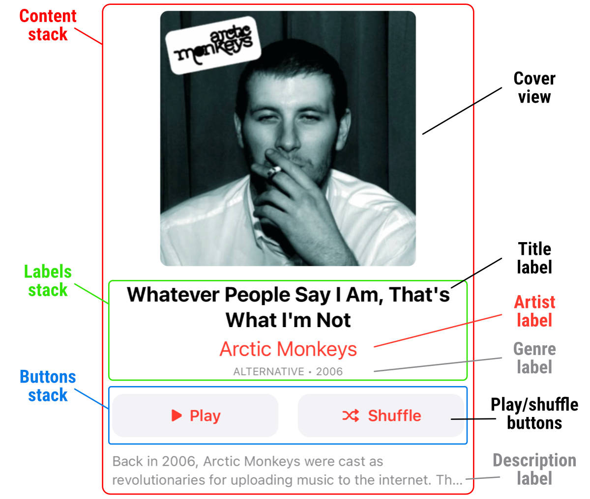
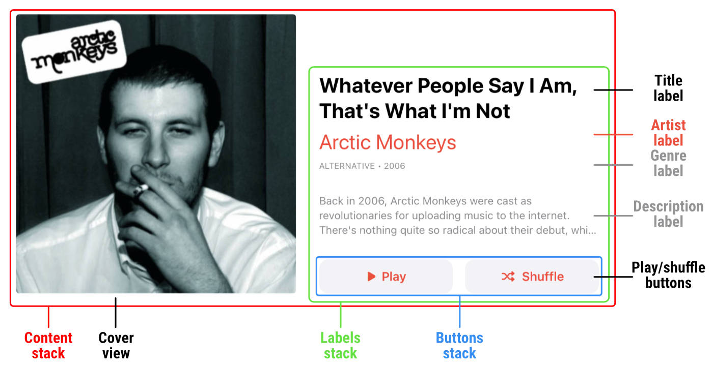
class AlbumHeaderView: UIView {

    private let contentStackView = UIStackView()
    private let coverView = UIImageView()
    private let labelsStack = UIStackView()
    private let titleLabel = UILabel()
    private let artistLabel = UILabel()
    private let genreLabel = UILabel()
    private let descriptionLabel = UILabel()
    private let playButton = AlbumButton(type: .system)
    private let shuffleButton = AlbumButton(type: .system)
    private let buttonsStack = UIStackView()

    ...

}
Here’s the breakdown of the views:
Since the layout differs significantly between the size classes, we’ll split the view setup into separate methods:
private func setupView() {
    if self.traitCollection.horizontalSizeClass == .regular {
        self.setupRegularView()
    } else {
        self.setupCompactView()
    }
}

private func setupRegularView() {

}

private func setupCompactView() {

}
Compact layout
Let’s tackle the compact layout first. We are going to initialize all the views before we add any constraints.
Content stack
We start off with the content stack:
private func setupCompactView() {
    self.contentStackView.axis = .vertical
    self.contentStackView.alignment = .center
    self.contentStackView.distribution = .fill
    self.contentStackView.spacing = 16
    self.contentStackView.translatesAutoresizingMaskIntoConstraints = false
    self.contentStackView.directionalLayoutMargins = NSDirectionalEdgeInsets(top: 0, leading: 16, bottom: 16, trailing: 16)
    self.contentStackView.isLayoutMarginsRelativeArrangement = true
    self.addSubview(self.contentStackView)
}
Note even though the distribution property has a default value of fill we still set it here because we may switch from regular to compact size class and the distribution could change. We are also setting custom layout margins to have a small gap on the sides and the bottom (between the header and table rows).
Cover view
For the cover view we only set some common properties and most importantly decrease the compression resistance. This is necessary in order for Auto Layout to measure the size of the header correctly for the bounds we provide later on:
private func setupCompactView() {
    ...

    self.coverView.translatesAutoresizingMaskIntoConstraints = false
    self.coverView.contentMode = .scaleToFill
    self.coverView.layer.cornerRadius = 8
    self.coverView.layer.masksToBounds = true
    self.coverView.setContentCompressionResistancePriority(.defaultLow, for: .horizontal)
    self.contentStackView.addArrangedSubview(self.coverView)
}
Labels stack
Next up are the labels for the name of the album, artist and genre. We set the font and other properties for each and add a nested vertical stack view to simplify the spacing between the labels. Once again the compression resistance must be lowered to receive correct measurements later:
private func setupCompactView() {
    ...

    // Labels stack
    self.labelsStack.axis = .vertical
    self.labelsStack.spacing = 4
    self.labelsStack.translatesAutoresizingMaskIntoConstraints = false
    self.labelsStack.setContentCompressionResistancePriority(.defaultLow, for: .horizontal)
    self.contentStackView.addArrangedSubview(self.labelsStack)

    // Title label
    let font: UIFont = UIFont.preferredFont(forTextStyle: .title2)
    self.titleLabel.font = UIFont(descriptor: font.fontDescriptor.withSymbolicTraits(.traitBold)!, size: font.pointSize)
    self.titleLabel.textAlignment = .center
    self.titleLabel.numberOfLines = 2
    self.titleLabel.textColor = .label
    self.titleLabel.setContentCompressionResistancePriority(.defaultLow, for: .horizontal)
    self.labelsStack.addArrangedSubview(self.titleLabel)

    // Artist label
    self.artistLabel.textAlignment = .center
    self.artistLabel.font = UIFont.preferredFont(forTextStyle: .title2)
    self.artistLabel.numberOfLines = 2
    self.artistLabel.setContentCompressionResistancePriority(.defaultLow, for: .horizontal)
    self.labelsStack.addArrangedSubview(self.artistLabel)

    // Genre label
    self.genreLabel.textAlignment = .center
    self.genreLabel.font = UIFont.preferredFont(forTextStyle: .caption1)
    self.genreLabel.textColor = .secondaryLabel
    self.genreLabel.setContentCompressionResistancePriority(.defaultLow, for: .horizontal)
    self.labelsStack.addArrangedSubview(self.genreLabel)
}
Buttons stack
The buttons stack uses fillEqually distribution to have the two buttons sized equally. We create two helper methods addButtons and getButtonImage to initialize the buttons and add them to the stack. We’ll reuse these methods for the regular size class:
private func setupCompactView() {
    ...

    self.buttonsStack.axis = .horizontal
    self.buttonsStack.distribution = .fillEqually
    self.buttonsStack.spacing = 20
    self.buttonsStack.translatesAutoresizingMaskIntoConstraints = false
    self.buttonsStack.setContentCompressionResistancePriority(.defaultLow, for: .horizontal)
    self.contentStackView.addArrangedSubview(self.buttonsStack)

    self.addButtons(to: self.buttonsStack)
}

private func addButtons(to stack: UIStackView) {
    self.playButton.setImage(self.getButtonImage(name: "play.fill"), for: .normal)
    self.playButton.setTitle("Play", for: .normal)
    stack.addArrangedSubview(self.playButton)

    self.shuffleButton.setImage(self.getButtonImage(name: "shuffle"), for: .normal)
    self.shuffleButton.setTitle("Shuffle", for: .normal)
    stack.addArrangedSubview(self.shuffleButton)
}

private func getButtonImage(name: String) -> UIImage? {
    let size: CGFloat = UIFont.preferredFont(forTextStyle: .caption1).pointSize
    let config = UIImage.SymbolConfiguration(pointSize: size, weight: .semibold)
    return UIImage(systemName: name, withConfiguration: config)
}
Description label
The final view in the content stack is the description label, nothing special here:
private func setupCompactView() {
    ...

    self.descriptionLabel.font = UIFont.preferredFont(forTextStyle: .subheadline)
    self.descriptionLabel.textColor = .secondaryLabel
    self.descriptionLabel.numberOfLines = 2
    self.descriptionLabel.setContentCompressionResistancePriority(.defaultLow, for: .horizontal)
    self.contentStackView.addArrangedSubview(self.descriptionLabel)
}
Compact size class constraints
With all the views initialized, we can move on to constraints. We’ll create another method and call it at the end of setupCompactView:
private func setupCompactView() {
    ...

    self.addCompactConstraints()
}

private func addCompactConstraints() {

}
Once again we’ll add a member property to AlbumHeaderView to keep track of the active constraints:
private var activeConstraints: [NSLayoutConstraint] = []As always the first thing we should do is deactivate any active constraints before creating new ones:
private func addCompactConstraints() {
    NSLayoutConstraint.deactivate(self.activeConstraints)
    self.activeConstraints.removeAll()
}
We begin by constraining the content stack to all the edges of the header view. We must use optional constraints because the header may only receive its size after its subviews are laid out. That means Auto Layout would not be able to satisfy the constraints below for a moment and could break the layout unexpectedly:
private func addCompactConstraints() {
    ...

    self.activeConstraints.append(contentsOf: [
        self.contentStackView.leadingAnchor.constraint(equalTo: self.leadingAnchor).withPriority(.defaultHigh),
        self.contentStackView.trailingAnchor.constraint(equalTo: self.trailingAnchor).withPriority(.defaultHigh),
        self.contentStackView.topAnchor.constraint(equalTo: self.topAnchor).withPriority(.defaultHigh),
        self.contentStackView.bottomAnchor.constraint(equalTo: self.bottomAnchor).withPriority(.defaultHigh)
    ])
}center alignment which means it won't resize the arranged subviews and we should explicitly set the size (width) constraint for every view to override its intrinsic width.
The cover view will be limited to 2⁄3 of the content’s width. The height of the image will match its width, creating a square image:
private func addCompactConstraints() {
    ...

    self.activeConstraints.append(contentsOf: [
        self.coverView.widthAnchor.constraint(equalTo: self.contentStackView.widthAnchor, multiplier: 2.0 / 3.0),
        self.coverView.heightAnchor.constraint(equalTo: self.coverView.widthAnchor)
    ])
}
For the rest of the views we only set the width anchor to match the layout margin of the content stack:
private func addCompactConstraints() {
    ...

    // Labels stack
    self.activeConstraints.append(contentsOf: [
        self.labelsStack.widthAnchor.constraint(equalTo: self.contentStackView.layoutMarginsGuide.widthAnchor)
    ])

    // Buttons stack
    self.activeConstraints.append(contentsOf: [
        self.buttonsStack.widthAnchor.constraint(equalTo: self.contentStackView.layoutMarginsGuide.widthAnchor)
    ])

    // Description label
    self.activeConstraints.append(contentsOf: [
        self.descriptionLabel.widthAnchor.constraint(equalTo: self.contentStackView.layoutMarginsGuide.widthAnchor)
    ])
}
Finally we activate the constraints:
private func addCompactConstraints() {
    ...

    NSLayoutConstraint.activate(self.activeConstraints)
}
This concludes the setup for the compact layout.
Regular layout
We’ll build the regular layout in a very similar fashion — initialize the views first and then add any necessary constraints. Here’s the breakdown of the layout:
Content stack
We begin with the content stack. It uses horizontal arrangement with bottom alignment and equal size distribution of the views, resulting in a two column layout with the cover image on the left and labels stack on the right:
private func setupRegularView() {
    self.contentStackView.axis = .horizontal
    self.contentStackView.alignment = .bottom
    self.contentStackView.distribution = .fillEqually
    self.contentStackView.spacing = 30
    self.contentStackView.directionalLayoutMargins = NSDirectionalEdgeInsets(top: 0, leading: 20, bottom: 20, trailing: 20)
    self.contentStackView.isLayoutMarginsRelativeArrangement = true
    self.contentStackView.translatesAutoresizingMaskIntoConstraints = false
    self.addSubview(self.contentStackView)
}
Cover view
The cover view is initialized exactly the same as for the compact layout and added to the content stack:
private func setupRegularView() {
    ...

    self.coverView.translatesAutoresizingMaskIntoConstraints = false
    self.coverView.contentMode = .scaleToFill
    self.coverView.layer.cornerRadius = 4
    self.coverView.layer.masksToBounds = true
    self.coverView.setContentCompressionResistancePriority(.defaultLow, for: .horizontal)
    self.contentStackView.addArrangedSubview(self.coverView)
}
Labels stack & labels
In the regular layout the labels stack contains not only all the labels but also the buttons stack. The labels come first and are initialized very similarly to the compact version, we just set custom spacing after the genre and description labels. The labels stack is added to the content stack, while the individual labels are added to the labels stack:
private func setupRegularView() {
    ...

    // Labels stack (for the buttons as well)
    self.labelsStack.axis = .vertical
    self.labelsStack.spacing = 8
    self.labelsStack.setContentCompressionResistancePriority(.defaultLow, for: .horizontal)
    self.contentStackView.addArrangedSubview(self.labelsStack)

    // Title label
    let font: UIFont = UIFont.preferredFont(forTextStyle: .title1)
    self.titleLabel.font = UIFont(descriptor: font.fontDescriptor.withSymbolicTraits(.traitBold)!, size: font.pointSize)
    self.titleLabel.numberOfLines = 2
    self.titleLabel.textColor = .label
    self.titleLabel.setContentCompressionResistancePriority(.defaultLow, for: .horizontal)
    self.labelsStack.addArrangedSubview(self.titleLabel)

    // Artist label
    self.artistLabel.font = UIFont.preferredFont(forTextStyle: .title1)
    self.artistLabel.numberOfLines = 2
    self.titleLabel.setContentCompressionResistancePriority(.defaultLow, for: .horizontal)
    self.labelsStack.addArrangedSubview(self.artistLabel)

    // Genre label
    self.genreLabel.font = UIFont.preferredFont(forTextStyle: .caption1)
    self.genreLabel.textColor = .secondaryLabel
    self.genreLabel.setContentCompressionResistancePriority(.defaultLow, for: .horizontal)
    self.labelsStack.addArrangedSubview(self.genreLabel)
    self.labelsStack.setCustomSpacing(30, after: self.genreLabel)

    // Description label
    self.descriptionLabel.font = UIFont.preferredFont(forTextStyle: .subheadline)
    self.descriptionLabel.textColor = .secondaryLabel
    self.descriptionLabel.numberOfLines = 3
    self.descriptionLabel.setContentCompressionResistancePriority(.defaultLow, for: .horizontal)
    self.labelsStack.addArrangedSubview(self.descriptionLabel)
    self.labelsStack.setCustomSpacing(30, after: self.descriptionLabel)
}
Buttons stack
The buttons stack is the last view in the right column. Once again we use equal sizing and reuse the addButtons method for the individual button setup:
private func setupRegularView() {
    ...

    self.buttonsStack.axis = .horizontal
    self.buttonsStack.distribution = .fillEqually
    self.buttonsStack.spacing = 16
    self.buttonsStack.setContentCompressionResistancePriority(.defaultLow, for: .horizontal)
    self.labelsStack.addArrangedSubview(self.buttonsStack)

    self.addButtons(to: self.buttonsStack)
}
Regular size class constraints
Now we can move on to constraints for the regular layout. It will be much simpler in this case since most of the views are sized automatically by stack views.
We’ll create another method and call it at the end of setupRegularView:
private func setupRegularView() {
    ...

    self.addRegularConstraints()
}

private func addRegularConstraints() {

}
As always we deactivate any constraints first:
private func addRegularConstraints() {
    NSLayoutConstraint.deactivate(self.activeConstraints)
    self.activeConstraints.removeAll()
}
We need to constrain the content stack to all the header’s edegs. Again we use optional constraints to prevent any Auto Layout issues before the header view receives its size:
private func addRegularConstraints() {
    self.activeConstraints.append(contentsOf: [
        self.contentStackView.leadingAnchor.constraint(equalTo: self.leadingAnchor).withPriority(.defaultHigh),
        self.contentStackView.trailingAnchor.constraint(equalTo: self.trailingAnchor).withPriority(.defaultHigh),
        self.contentStackView.topAnchor.constraint(equalTo: self.topAnchor).withPriority(.defaultHigh),
        self.contentStackView.bottomAnchor.constraint(equalTo: self.bottomAnchor).withPriority(.defaultHigh)
    ])
}
And the last constraint we want to set is for the cover view. We want to have a square image so we set the height anchor to match its own width anchor. Remember the width of the cover view is set by the content stack due to equal sizing distribution:
private func addRegularConstraints() {
    ...

    self.activeConstraints.append(contentsOf: [
        self.coverView.heightAnchor.constraint(equalTo: self.coverView.widthAnchor)
    ])
}
All that’s left to do is activate the constraints:
private func addRegularConstraints() {
    ...

    NSLayoutConstraint.activate(self.activeConstraints)
}
Artist label color
Maybe you’ve noticed we have not set the color of the artist label anywhere. This is because we want the label to have the color of the application tint. Similar to what we saw during the table cell setup, we can’t reliably set the color during the initialization since the tintColor property of the header may still refer to the default system blue. Due to this we set the color in the layoutSubviews method:
override func layoutSubviews() {
    super.layoutSubviews()

    self.artistLabel.textColor = self.tintColor
}
Adapting header to size class
With the setup and constraints done for both size classes, we need to react to the potential change of the size class. As usual we do that in the traitCollectionDidChange method:
override func traitCollectionDidChange(_ previousTraitCollection: UITraitCollection?) {
    super.traitCollectionDidChange(previousTraitCollection)

    if previousTraitCollection?.horizontalSizeClass != self.traitCollection.horizontalSizeClass {
        // (1)
        for view in self.contentStackView.subviews {
            view.removeFromSuperview()
        }

        // (2)
        self.contentStackView.removeFromSuperview()
        self.activeConstraints.removeAll()

        // (3)
        if self.traitCollection.horizontalSizeClass == .regular {
            self.setupRegularView()
        } else {
            self.setupCompactView()
        }
    }
}
Every time the size class changes we clean up and rebuild the view hierarchy:
- We remove every subview from the content stack because the order of the views differ. To avoid any issues we start from scratch.
- The content stack is removed from the header, which also removes any constraints we added earlier between the content and the header. We also clear out the active constraints array.
- Finally we call the correct setup method depending on the active size class. With this approach it is imperative we reset all the necessary properties on the views when reusing them.
We are nearly done with the header! As the last thing let’s create an update method to populate the views with our view model:
func update(viewModel: Album.Header.ViewModel) {
    self.coverView.image = viewModel.coverImage
    self.titleLabel.text = viewModel.title
    self.artistLabel.text = viewModel.artistName
    self.genreLabel.text = viewModel.genre
    self.descriptionLabel.text = viewModel.description
}
Measuring header view
The final thing we need to do in this example is to assign the header to the table view and set the header’s height. We return to the root view controller and start by creating an instance of the header inside the viewDidLoad method:
override func viewDidLoad() {
    super.viewDidLoad()

    let header = AlbumHeaderView()
    header.update(viewModel: self.viewModel.header)
    self.tableView.tableHeaderView = header

    // table view added to the view hierarchy here
}
Next we measure the header’s size at the end of the viewDidLayoutSubviews method, outside of the existing if !self.isInitialized block. We want to size the header every time the view controller updates its layout, not only once:
override func viewDidLayoutSubviews() {
    super.viewDidLayoutSubviews()

    if !self.isInitialized {
        ...
    }

    // Measure the size of the header
    if let headerView = self.tableView.tableHeaderView as? AlbumHeaderView {
        // (1)
        let sizeToFit: CGSize = CGSize(width: headerView.bounds.width, height: 0)

        // (2)
        let layoutSize: CGSize = headerView.systemLayoutSizeFitting(sizeToFit, withHorizontalFittingPriority: .required, verticalFittingPriority: .fittingSizeLevel)

        // (3)
        if headerView.frame.size.height != layoutSize.height {
            var frame: CGRect = headerView.frame
            frame.size.height = layoutSize.height
            headerView.frame = frame
            self.tableView.tableHeaderView = headerView
        }
    }
}- We create
CGSizestruct to provide the size to which the header should fit. The width uses the header's width (that is set by the table view for us), while the height is set to zero. That means we want the receive the smallest height the header is able to fit in. - We use the
systemLayoutSizeFittingmethod on the header view to obtain the layout size. The horizontal fitting priority is set torequiredto prevent the header from sizing itself more than thesizeToFit.widthspecifies. The vertical fitting priority offittingSizeLevelwill allow the header to take on as much height as it needs. - When the calculated height is different from the current one we update the header's frame and re–assign the view to the table to make it refresh the header's height.
We can build and run the project to finally see our complete layout!
systemLayoutSizeFitting method.
Source code
Complete source code for this and all the other examples is available on GitHub.
Where to next
- Intro
- Basics, Part One
- Basics, Part Two
- Xcode Setup
- Sign Up Screen
- Stack Views
- Custom UIAlert
- Players Profile
- Twitter Timeline
- Twitter Profile
- Music Album (reading now)