In this example we are going to build a custom UIAlert view. The layout itself is simple, but it will serve the purpose of learning about the layout pass and the layoutIfNeeded method.
Overview
The alert view is composed of a title, message and buttons. The alert’s width is limited at 270 points and is allowed to grow vertically. We are mostly interested in the buttons stack. If the buttons fit within the alert’s width they should be arranged horizontally, otherwise we want to switch the stack’s axis to vertical. Let’s see how we can achieve that.
Create a new iOS project in Xcode or open the starting project for this example, it is available on GitHub.
View model
First we’ll define a view model for the alert’s button. The button can be one of three styles:
- Regular — default sytem button.
- Default — default button with a bold title.
- Destructive — default button with a red tint.
enum Button {

    enum Style {
        case `default`, destructive, regular
    }

    struct ViewModel {
        let title: String
        let style: Button.Style
    }

}
Next we have a view model for the alert:
enum Alert {

    struct ViewModel {
        let title: String
        let message: String
        let buttons: [Button.ViewModel]
    }

}
Finally we create sample models for two alerts:
enum SampleModel {
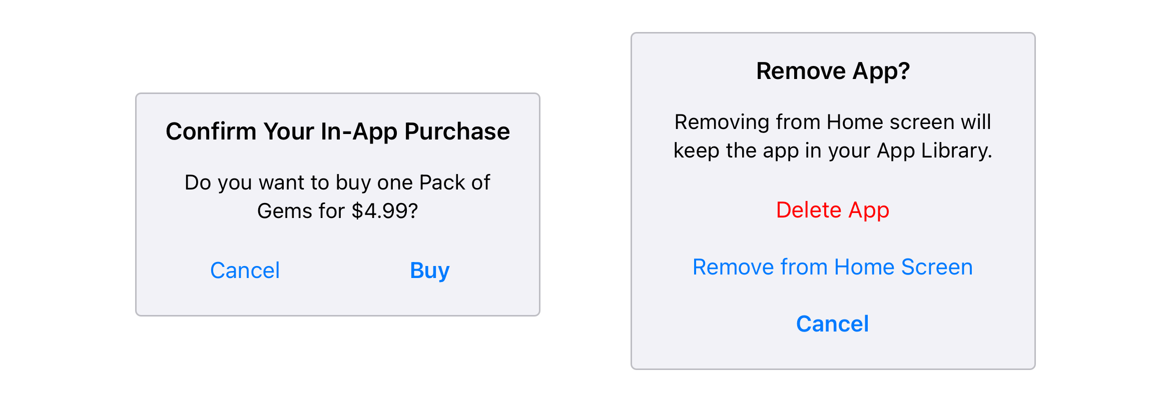
static let removeAppAlert: Alert.ViewModel = Alert.ViewModel(title: "Remove App?", message: "Removing from Home screen will keep the app in your App Library.", buttons: [
Button.ViewModel(title: "Cancel", style: .default),
Button.ViewModel(title: "Remove from Home Screen", style: .regular),
Button.ViewModel(title: "Delete App", style: .destructive)
])
static let purchaseAlert: Alert.ViewModel = Alert.ViewModel(title: "Confirm Your In-App Purchase", message: "Do you want to buy one Pack of Gems for $4.99?", buttons: [
Button.ViewModel(title: "Cancel", style: .regular),
Button.ViewModel(title: "Buy", style: .default)
])
}Alert view
Let’s create a new file AlertView.swift and add a subclass of UIView:
class AlertView: UIView {

    init() {
        super.init(frame: .zero)

        self.setupView()
    }

    required init?(coder aDecoder: NSCoder) {
        fatalError("init(coder:) has not been implemented")
    }

    private func setupView() {

    }

}
In the setupView we’ll only set some styling properties on the view itself, like the border, background color and layout margins:
private func setupView() {
    self.translatesAutoresizingMaskIntoConstraints = false
    self.layer.borderColor = UIColor.separator.cgColor
    self.layer.borderWidth = 1
    self.layer.cornerRadius = 4
    self.layoutMargins = UIEdgeInsets(top: 16, left: 16, bottom: 16, right: 16)
    self.backgroundColor = UIColor.secondarySystemBackground
}
Next we’ll create a method to populate the view with the view model. This is also where we’ll create the subviews and constraints:
func setContent(viewModel: Alert.ViewModel) {

}
Title label
We’ll start with the title label. First we set some styling properties, then activate the constraints right away:
func setContent(viewModel: Alert.ViewModel) {
    let titleLabel = UILabel()
    titleLabel.translatesAutoresizingMaskIntoConstraints = false
    titleLabel.font = UIFont.preferredFont(forTextStyle: .headline)
    titleLabel.textColor = .label
    titleLabel.textAlignment = .center // (1)
    titleLabel.numberOfLines = 0
    titleLabel.text = viewModel.title
    self.addSubview(titleLabel)

    NSLayoutConstraint.activate([
        titleLabel.leadingAnchor.constraint(equalTo: self.layoutMarginsGuide.leadingAnchor), // (2)
        titleLabel.trailingAnchor.constraint(equalTo: self.layoutMarginsGuide.trailingAnchor), // (2)
        titleLabel.topAnchor.constraint(equalTo: self.layoutMarginsGuide.topAnchor) // (3)
    ])
}- The label will be stretched horizontally to fill the available space so the text alignment is set to center.
- The leading and trailing anchors are pinned to the layout margins guide of the alert view to fill the entire available space horizontally.
- Similarly the top anchor is also pinned to the layout margins guide, making the title label appear at the top of the alert view.
Message label
The message label is created in a similar fashion as the title:
func setContent(viewModel: Alert.ViewModel) {
    ...

    let messageLabel = UILabel()
    messageLabel.translatesAutoresizingMaskIntoConstraints = false
    messageLabel.font = UIFont.preferredFont(forTextStyle: .subheadline)
    messageLabel.textColor = .label
    messageLabel.textAlignment = .center
    messageLabel.numberOfLines = 0
    messageLabel.text = viewModel.message
    self.addSubview(messageLabel)

    NSLayoutConstraint.activate([
        messageLabel.leadingAnchor.constraint(equalTo: self.layoutMarginsGuide.leadingAnchor), // (1)
        messageLabel.trailingAnchor.constraint(equalTo: self.layoutMarginsGuide.trailingAnchor), // (1)
        messageLabel.topAnchor.constraint(equalTo: titleLabel.bottomAnchor, constant: 16) // (2)
    ])
}- Same as the title the message uses its leading and trailing anchors to span across the entire width of the alert.
- The top anchor is pinned to the bottom of the title to make it appear below.
Buttons
We’ll use a stack view as a container to simplify the layout of the alert’s buttons as we want to easily set either horizontal or vertical arrangement. We only need to set the spacing and disable the autoresizing mask for now:
func setContent(viewModel: Alert.ViewModel) {
    ...

    let buttonStack = UIStackView()
    buttonStack.spacing = 8
    buttonStack.translatesAutoresizingMaskIntoConstraints = false
    self.addSubview(buttonStack)
}
We won’t set any constraints yet because we want to find out the natural size of the stack view when the buttons are arranged horizontally at their intrinsic size. We’ll add a method to convert the button’s view model to UIButton to be able to create our buttons easily:
private func getButton(viewModel: Button.ViewModel, index: Int) -> UIButton {
    let button = UIButton(type: .system)
    button.tag = index
    button.setTitle(viewModel.title, for: .normal)
    button.addTarget(self, action: #selector(self.buttonDidTap), for: .touchUpInside)

    switch viewModel.style {
    case .default:
        let font: UIFont = button.titleLabel!.font
        button.titleLabel?.font = UIFont(descriptor: font.fontDescriptor.withSymbolicTraits(.traitBold)!, size: font.pointSize)
    case .destructive:
        button.titleLabel?.tintColor = .red
    case .regular:
        break
    }

    return button
}

@objc private func buttonDidTap(_ sender: UIButton) {
    // todo process the tap
}
We’ll handle the button tap later. Now we return to the setContent method, create a button for each view model and add it to the stack view:
func setContent(viewModel: Alert.ViewModel) {
    ...

    for (index, model) in viewModel.buttons.enumerated() {
        let button = self.getButton(viewModel: model, index: index)
        buttonStack.addArrangedSubview(button)
    }
}
With the buttons part of the stack view we can now get the stack’s bounds and see if it occupies more space than the max alert’s width:
class AlertView: UIView {

    static let contentWidth: CGFloat = 270 // (1)

    ...

    func setContent(viewModel: Alert.ViewModel) {
        ...

        let maxWidth: CGFloat = AlertView.contentWidth - (self.layoutMargins.left + self.layoutMargins.right) // (2)
        let buttonsWidth: CGFloat = buttonStack.bounds.width // (3)

        if buttonsWidth > maxWidth { // (4)
            buttonStack.axis = .vertical
            buttonStack.alignment = .center
        } else {
            buttonStack.axis = .horizontal
            buttonStack.distribution = .fillEqually
        }
    }
}- We define a static constant for the maximum alert width.
- We use the constant and subtract the layout margins to calculate the maximum width the buttons can occupy.
- We get the bounds of the stack view to retrieve the current width of the buttons.
- We compare the two values and set either a vertical or horizontal arrangement.
Finally we’ll add the constraints for the stack view as well:
func setContent(viewModel: Alert.ViewModel) {
    ...

    NSLayoutConstraint.activate([
        buttonStack.leadingAnchor.constraint(equalTo: self.layoutMarginsGuide.leadingAnchor), // (1)
        buttonStack.trailingAnchor.constraint(equalTo: self.layoutMarginsGuide.trailingAnchor), // (1)
        buttonStack.topAnchor.constraint(equalTo: messageLabel.bottomAnchor, constant: 16), // (2)
        buttonStack.bottomAnchor.constraint(equalTo: self.layoutMarginsGuide.bottomAnchor), // (3)
    ])
}- The leading and trailing anchors are pinned to the layout margins guide just like the labels previously.
- The top anchor is pinned to the bottom of the message label.
- The bottom anchor is pinned to the bottom of the layout margins guide, which ensures the alert view has its height defined properly.
Handling button tap
When using the alert view it’s likely we will want to have some sort of feedback when one of the buttons is tapped. We’ll use the delegate pattern to implement this.
First add a delegate protocol to AlertView.swift:
protocol AlertViewDelegate: AnyObject {
    func alertButtonDidTap(at index: Int)
}
Then add a weak property to store a reference to the delegate:
class AlertView: UIView {

    weak var delegate: AlertViewDelegate?

    ...

}
Finally in the buttonDidTap method we created earlier we’ll call the delegate’s method:
@objc private func buttonDidTap(_ sender: UIButton) {
    self.delegate?.alertButtonDidTap(at: sender.tag)
}
We are using the button’s tag that we set when the button is initialized to communicate back the index of the button.
Alert view controller
We’ll create a separate view controller that will take care of displaying our custom alert view. This will make it simpler to present an alert from any other view controller using the standard UIKit API:
class AlertViewController: UIViewController, AlertViewDelegate {

    var viewModel: Alert.ViewModel? // (1)

    override func viewDidLoad() {
        super.viewDidLoad()

        self.view.backgroundColor = UIColor.systemBackground.withAlphaComponent(0.9)

        guard let viewModel = self.viewModel else {
            fatalError("Unexpected application state.")
        }

        // (2)
        let view = AlertView()
        view.setContent(viewModel: viewModel)
        view.delegate = self
        self.view.addSubview(view)

        // (3)
        NSLayoutConstraint.activate([
            view.centerXAnchor.constraint(equalTo: self.view.centerXAnchor),
            view.centerYAnchor.constraint(equalTo: self.view.centerYAnchor),
            view.widthAnchor.constraint(equalToConstant: AlertView.maxWidth)
        ])
    }

    func alertButtonDidTap(at index: Int) {
        self.presentingViewController?.dismiss(animated: true, completion: nil)
    }

}- The view controller has a property for the alert's view model. We'll set the model before presenting the view controller.
- The alert view is added to the view controller's view and populated with the view model. We also set the delegate to dismiss the alert when one of the buttons is tapped.
- The alert is then centered both horizontally and vertically and its width is fixed to the constant we defined earlier.
Presenting alerts
With the alert view controller implemented, let’s return to the root view controller and add two buttons to present sample alerts:
override func viewDidLoad() {
super.viewDidLoad()
let button1: UIButton = UIButton(type: .system)
button1.translatesAutoresizingMaskIntoConstraints = false
button1.setTitle("Show Alert 1", for: .normal)
button1.addTarget(self, action: #selector(self.showRemoveAppAlert), for: .touchUpInside)
self.view.addSubview(button1)
NSLayoutConstraint.activate([
button1.centerXAnchor.constraint(equalTo: self.view.centerXAnchor),
button1.bottomAnchor.constraint(equalTo: self.view.safeAreaLayoutGuide.centerYAnchor)
])
let button2: UIButton = UIButton(type: .system)
button2.translatesAutoresizingMaskIntoConstraints = false
button2.setTitle("Show Alert 2", for: .normal)
button2.addTarget(self, action: #selector(self.showPurchaseAlert), for: .touchUpInside)
self.view.addSubview(button2)
NSLayoutConstraint.activate([
button2.centerXAnchor.constraint(equalTo: self.view.centerXAnchor),
button2.topAnchor.constraint(equalTo: self.view.safeAreaLayoutGuide.centerYAnchor)
])
}
@objc private func showRemoveAppAlert() {
let vc = AlertViewController()
vc.modalPresentationStyle = .overCurrentContext
vc.modalTransitionStyle = .crossDissolve
vc.viewModel = SampleModel.removeAppAlert
self.present(vc, animated: true, completion: nil)
}
@objc private func showPurchaseAlert() {
let vc = AlertViewController()
vc.modalPresentationStyle = .overCurrentContext
vc.modalTransitionStyle = .crossDissolve
vc.viewModel = SampleModel.purchaseAlert
self.present(vc, animated: true, completion: nil)
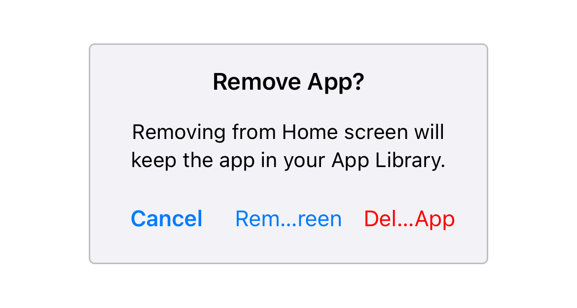
}At this point we can run the project and tap the buttons to have the alert view appear, though we’ll quickly notice that it is not working as expected. The first alert incorrectly arranges the buttons horizontally even though they clearly cannot fit:
The layout pass
If we go back to AlertView.swift to where we compare the width of the alert and the buttons stack, add a breakpoint or a print statement for the buttonsWidth value, we’ll find that the reported width is actually zero. To understand the problem we need to dig a little under the hood of the layout engine.
First of all we need to remember that UIStackView uses constraints internally to layout its arranged subviews. Second we need to realize when the layout engine actually processes the active constraints to layout the views. When we create and activate a constraint, the layout engine does not immediately resize and reposition the affected views. We often add multiple constraints at once so it would be very inefficient. Instead the layout changes are not processed until the next cycle of the application run loop. When the layout pass occurs the following methods are called for each affected view and view controller:
UIViewController |
UIView |
|---|---|
viewWillLayoutSubviews, viewDidLayoutSubviews |
layoutSubviews |
Each view has a "needs layout" flag that specifies whether a view’s layout should be updated during the next layout pass. This flag is automatically set to true when we add or remove constraints from a view. Since the stack view also uses constraints internally, we cannot retrieve its size immediately unless we force the layout pass to occur right away. Fortunately we can do this with the layoutIfNeeded method available on each UIView.
So in our example we can use the method just after we add the buttons to the stack before we do the comparison of the widths:
func setContent(viewModel: Alert.ViewModel) {
    ...

    // (1)
    buttonStack.layoutIfNeeded()

    // (2)
    let maxWidth: CGFloat = AlertView.maxWidth - (self.layoutMargins.left + self.layoutMargins.right)
    let buttonsWidth: CGFloat = buttonStack.bounds.width
}- First we force the layout pass to occur on
buttonStack. - Querying the
boundsproperty now reports the correct value, which makes our conditional work properly.
Build and run the project to confirm that the first alert now correctly arranges the buttons vertically!
Source code
Complete source code for this and all the other examples is available on GitHub.
Where to next
- Intro
- Basics, Part One
- Basics, Part Two
- Xcode Setup
- Sign Up Screen
- Stack Views
- Custom UIAlert (reading now)
- Players Profile
- Twitter Timeline
- Twitter Profile
- Music Album